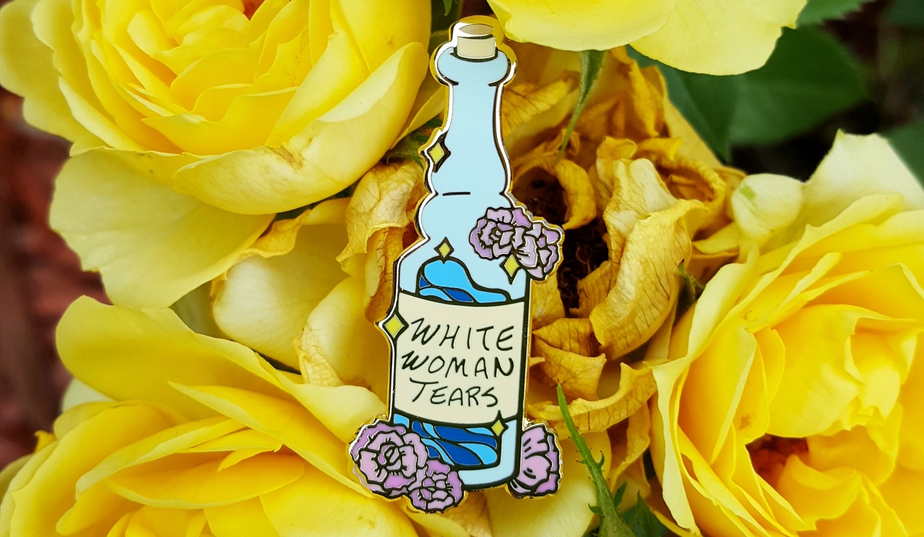
The second pin I released recently is less intuitive for some people.

There are explanations of “white woman tears” online. I want to add to that because 1) I think more people talking about the themes behind white woman tears is a good thing and 2) I want to have a resource I can point to when people ask about this pin.

Before we continue, a note. I’m not white but I’m a light-passing minority. I’m sometimes seen as white, sometimes not. It’s all about context. Maybe I’m “Almost White,” as comedian Rick Najera titled his memoir. The point is, I want to acknowledge my position before I dive into this topic.


Is This Pin Making Fun of White People?


First, there’s humor in this. Someone online asked if this pin was “serious” and said that they really hoped this was a joke. I didn’t know how to respond. What would this pin being “serious” even mean?

Yes, this is a joke. A longstanding one. But one with serious meaning behind it. We can go into varying levels of seriousness. I’ll even label them, so if the higher levels are too much, you can always scroll away.


Level 1: Haha Privilege


On a super surface level, you could interpret this pin as just being about privilege. Think #firstworldproblems and crying over small things.

But with White Woman Tears, we’re talking specifically about white privilege. It’s hard to find a definition, mostly because a simple definition isn’t enough. But first, that definition. An article from Teaching Tolerance uses this definition from author Francis E. Kendall:

White privilege means “having greater access to power and resources than people of color [in the same situation] do.”

Maybe you have some thoughts about that definition. (Actually I hope you do; that’s what our brains are for.) Do you find yourself questioning it? Are you pulling up examples that contradict this definition? Are you wondering how poor whites fit into the equation? Or how privilege can apply to someone who’s worked hard for everything they have?

Good, because then we can have a conversation.


I said earlier that defining white privilege isn’t enough. That’s because even when defined, people don’t get it. That same article puts it well:

“The two-word term packs a double whammy that inspires pushback. 1) The word white creates discomfort among those who are not used to being defined or described by their race. And 2) the word privilege, especially for poor and rural white people, sounds like a word that doesn’t belong to them—like a word that suggests they have never struggled.”

It’s almost easier to define all the things white privilege is NOT. So if you’re interested in delving into the topic further, I challenge you to go through “What is White Privilege, Really?” and skim for what is not white privilege. They’ve included a good amount of history there too.

If stories are more your style, Lori Lakin Hutcherson has the done the work of sharing several of her own, complete with bolded takeaways at the end of each example. Definitely a worthwhile read and you can just pretend you’ve fallen down a Facebook rabbit hole.

I wasn’t intending to spend much time on Level 1 here, but white privilege is complex and worth understanding.


Level 2: The Crying Part


The main idea behind White Woman Tears is that white women cry to shut down hard conversations.

I want to be clear. We’re talking about a specific circumstance here. I’m not referring to anytime a white woman cries. White Woman Tears come into play when a conversation is about a difficult topic, often one that acknowledges privilege. In this scenario, a white woman in the room (or multiple) gets defensive. Defensiveness isn’t always a concept you can identify visually. Maybe it just looks like someone getting emotional. So on the surface, it looks like this white woman in the room is getting emotional. Which may or may not lead to crying.

There’s a video in this Guardian article that demonstrates the point well (it’s the Jully Black and Jeanne Beker YouTube video). In this clip, there is no crying, but you can see the defensiveness rising, which Jully Black is quick to point out for what it is.

White Woman Tears is a thing. It’s a big enough thing that it’s a cultural phenomenon. Googling it turns up with far more relevant pages than “Wrong Asian” (the topic of my last post). White tears is also a thing, but let’s face it, toxic masculinity usually paints tears as feminine.

This might be a good time to pause and address some disclaimers, before anyone has to waste their energy tapping out a #NotAllWhiteWoman. Of course, not every white woman does this. Of course, white women aren’t the only individuals that have done this. But white women do this. A lot. Consistently.

I need us to agree on this point, even temporarily, to continue this discussion. So even if you don’t agree, humor me for a bit.


What’s Wrong with Crying?


Crying during a difficult conversation isn’t just about crying. Especially when the person crying holds considerable privilege (see Level 1) and the person bringing up the difficult topic does not.

Crying stops a conversation in its tracks. Crying changes the course of the conversation. Crying distracts from the issue at hand. Instead of addressing the harm or injustice that was brought up, crying puts all the attention on one individual, portrays them as the victim, and elicits sympathy from others in the room.

Some Many topics are bigger than one person’s feelings.

But crying during important conversations prioritizes one person’s discomfort over everything else. Over inequality, racism, life-harming and life-threatening circumstances (more on this last point in Level 3).

We’ve talked about how white women are the ones most likely to do this. There’s another piece of this pattern. Because crying calls attention to another party – the person who caused the crying. If the crying person becomes a victim, the one who brought up the “sensitive” topic becomes the bully. And too often the one made out to be a bully is a Black person.

People are quick to jump to this conclusion. It’s easy to see a crying white woman as a victim (see: pretty much every damsel in distress ever). It’s also easy to depict a Black person as scary, intimidating, and overly angry. I can only cover so much in one blog post, but I hope the links throughout and at the end of this post help.

To sum it up, White Woman Tears are a manifestation of privilege. They represent the ability to avoid conflict and discomfort by calling on stereotyped ideas of white womanhood as delicate and frail.

White Woman Tears is a joke based off of all that. With my pin, I wanted to poke fun at the idea of White Woman Tears as powerful, even magical.


white woman tears enamel pin against pink roses


Level 3: History

Wait there’s more? Unfortunately, yes. While Level 2 covers the basic knowledge needed to use White Woman Tears memes accurately, there’s also a serious, historical component.

During periods of US history, White Woman Tears were life-threatening.


An example in two words: Emmett Till.


In Till’s case, a white woman claimed that the 14-year-old had whistled at her. A group of white men killed him in response. His case was not unique. The NAACP draws makes the life-threatening nature of White Woman Tears clear:

“Whites started lynching because they felt it was necessary to protect white women.”

Another poignant quote from scholar and activist Danielle Slaughter:

“The most dangerous person in America isn’t the Black man or even the white man. It’s the white woman.”

Those damsels in distress mentioned earlier? They have more power than they know. There are several documented cases of Black men being harmed, imprisoned, and killed based on the word of a white woman. There are certainly far more cases that went undocumented. Going through these events is grueling and I’m getting tired. But please look into it if you’d like to know more.

And while we might seem far beyond historical events, consequences persist in different ways today, like when white coworkers got this reporter fired for sharing an article on white tears. The loss of a job isn’t life-or-death, but it is your livelihood.
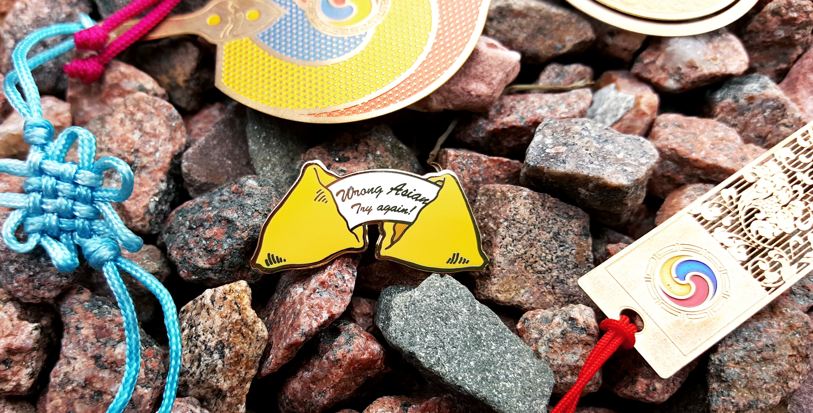
 

Excuse me while I blow the dust off this blog.

Is that better?

I admit, I’ve been fooling around with another blog. (Don’t tell, but I think I enjoy this art one more. I mean, I can write about anything I want, from emojis to succulents.)

I’m here with news of a new pin drop. Two actually.


Two pins on a floral cloth background. The first is shaped like a bottle and reads "White Woman Tears." The second is a fortune cookie with the message "Wrong Asian Try Again!"


These designs are a little less universal than my usual work (aka plants). As I share these designs, I’ve realized not everyone gets it. This is fine with me. But if you’re confused and wanting to learn more, I want to you to be able to do that. These pin designs are me starting the conversation. You can choose to engage, or not. And if this isn’t enough, there’s always Google.

The design I’ll talk about first is Wrong Asian.


Fortune cookie-shaped pin on spotted green begonia leaves


First, I have to give a shout-out to designer Linh-Yen Hoang. Her pin was the first time I saw this idea expressed on a pin (and I hope it won’t be the last!) If you haven’t seen her design, check it out! Last I checked, it was back in stock.


So What Does “Wrong Asian” Mean?

Wrong Asian is the more self-explanatory pin of the two. But again, I’ve realized I can’t just assume. Plus, there’s a lot of background to this pin and I like talking about it. This is a fun moment for me where my interests in art and sociology merge nicely. Get ready while I geek out for a bit.


Wrong Asian pin in front of a pair of brown and blue plastic frame glasses


Being a racial minority in America means you stand out. And when you live in a predominantly white neighborhood or go to predominantly white schools, your appearance can feel like a permanent spotlight.

Asians occupy an interesting place in America. Although Asian-Americans are often seen as having “made it” – into good schools, better paying-jobs and higher income brackets than their Black and Latino counterparts – they also face the stereotype that they are always foreign. Asian Americans may be considered a “model minority” (a myth btw) but they are also “perpetual foreigners.” This is clear in cases when second- or third-generation Americans of Asian descent are still asked “where are you from?”, expected to speak a foreign (Asian) language, and are asked for stories about “their country.”

But being seen as distinct and foreign doesn’t mean individuals are seen as distinct.

Non-Asian Americans often mix up Asian Americans, regardless of actual appearance. Even when this mix-up is a mistake, it can still be hurtful to realize that others see you primarily by your race. But there’s a reason we tend to mix up people of different races or ethnicities than our own.


Multiple Wrong Asian fortune cookies lined up in rows


The Brain Science Behind Mix-ups

People who grow up in neighborhoods with a large Asian population are better at distinguishing Asian faces, regardless of their own race. The same is true for individuals who have spent a lot of time around Blacks. Or whites. The difference is that white faces in America are everywhere, from our politicians to comedians to lead actors to picture books. Even if we don’t live in predominantly white neighborhoods, Americans are constantly exposed to white faces.

But because we often have less exposure to people of other races, we aren’t as good as distinguishing between them. Researchers have called this the cross-race effect and it’s been very well-documented.

The good news is, even though the tendency to call on the “wrong Asian” is backed up by “science,” we aren’t stuck with this problem. People can get better. Spending time around people with different racial and ethnic backgrounds than your own improves your ability to distinguish between Black, Latino, or Asian faces. Even if you don’t live near or in diverse communities, one study finds that putting more effort into distinguishing between individuals improves facial recognition across race. Specifically, focusing on an individual instead of allowing our brains to simply place them into a category reduces the cross-race effect.

In other words, the human brain is smart. We can learn. We can do better.


Wrong Asian pin set on a pile of books including "On Writing" by Stephen King, "Nickel and Dimed" by Barbara Ehrenreich, and "Writing Life Stories"


Extra Reading

I’m far from the only person who has written about this. If you’re interested in reading more, here are a couple pieces I recommend:

Renea Goddard: “Mistaken Identities: Being the ‘Wrong’ Asian Girl

Jenée Desmond-Harris: “No, Neither Asians Nor Blacks All Look Alike


Wrong Asian pin placed into wooden drawing mannequin's arms
Quickstarter Shorty Squad Title Image


There’s a new crowdfunding method in town and its name is Quickstarter. Maybe you’ve heard of it. Or maybe the title had you wondering what in the world is that? Either way, you’ve come to the right place.


What is a Quickstarter?

A Quickstarter is…*drumroll please*…a very short Kickstarter. That’s all. It’s not a new platform at all. But before you leave with a “psshaw!”, you should know Quickstarters are an actual thing that the Kickstarter team acknowledges and encourages.

Kickstarter had humble beginnings, intended to support small creative projects. But now you can find anything from art zines to large-scale corporate endeavors. Companies and startups are using Kickstarter to fund everything from robots to ramen.

Giant, large-scale Kickstarter projects take on a different look. Most include press releases, endorsements from big names in their respective industries, and several “stretch goal” extensions.

To give you an idea of the scale of these projects, here are some highlights:

While impressive, these projects are a vast departure from what Kickstarter founders Peter Chen, Yancey Strickler, and Charles Adler intended. While Kickstarter’s mission is focused on creative projects, the most revenue has come from their games, design, and technology categories.

In response, they’ve launched the “Quickstarter,” described on their site as “an invitation to create small projects.” The idea is credited to Oscar Lhermitte, a designer based in London.


What’s Considered a Quickstarter?

There are 9 qualifying “rules” for running a Quickstarter. Like the whole concept of a Quickstarter, these rules are informal and not enforced in any way. Following these “rules” is entirely up to the project creator:

  1. Planned in 3 months or less.
  2. Runs for 20 days or less.
  3. Goal is under $1000.
  4. Backer rewards are under $50.
  5. Video (if used) shot in a single day.
  6. No creator-initiated media or PR.
  7. No paid ads.
  8. No stretch goals.
  9. The term “Quickstarter” is in your project name.

The rules are simple. In short, Kickstarter is telling creators to think small, spend less, and do less. Maybe I’m not the target audience for this initiative since anything I would put on Kickstarter would meet most, if not all, of these rules. Or maybe this is a roundabout way of telling individual creators like myself that there’s still a place for my kind of project.


Quickstarter Examples

There are a surprising number of Quickstarter projects already. Some of the most popular ones that articles have mentioned are the envelope bag, which is just a really strong bag that’s foldable…

https://www.kickstarter.com/projects/201500374/quickstarter-envelope-bag


…and the lazy postcard, which are postcards with cutouts so you have an excuse to write a really short (or not) message.

https://www.kickstarter.com/projects/1879976467/quickstarter-the-lazy-postcard

As a writer, that’s not really my thing, but 141 people were into it.


Personally, I liked Stami Studios‘s Sleeping Luna Pin Quickstarter.

Screenshot of Stami's Sleeping Luna Pin Quickstarter


So Why Do a Quickstarter?

Are there any special benefits to running a Quickstarter? Is there a good reason for big companies to start trying smaller projects or for small businesses to jump on board and label their projects “Quickstarters”?

I have no idea.

At this point, there doesn’t seem to be any particular benefit to running a Quickstarter over an ordinary Kickstarter. But I’m going to try one and here’s why:


It Can’t Hurt

I don’t know if there are any benefits to running a Quickstarter, but since the idea has been so highly promoted by Kickstarter, there can’t be any penalties either.


Rule Breaker? Not Me.

The project I’m drafting already meets all 9 Quickstarter rules. It’s a single enamel pin and I don’t plan to add any stretch goals. I suppose I can resist my urge to reach out to news outlets and my PR connections for this one.


Curiosity

If running a business on Instagram has taught me anything, it’s that there’s a LOT going on at the backend of any platform. Instagram is notorious for its confusing algorithm, which determines which posts you actually see on your feed.

So could jumping on the Quickstarter bandwagon get my project more traffic? Possibly. But I’m sure Kickstarter would never reveal if and how they prioritize projects on their platform, other than the blatant “Projects We Love” category.

Will running a Quickstarter get my campaign featured on the Quickstarter page? Again, it’s not clear. But currently, the most visible projects displayed are already listed as “Projects We Love.” You have to hit the “Load More” button several times to even see ordinary projects.


Still, I do think there are a couple reasons why “Quickstarter” is a nice thought:


  1. It communicates to creators that small projects are okay and relieves the pressure to promote your campaign like it’s a second job.
  2. It communicates to potential backers that this is a simple project with a quick turnaround.


In the end, I don’t expect much from running a Quickstarter, but I’m curious enough to try it.


My Quickstarter Plans

I’ll be holding a Quickstarter for *surprise surprise* an enamel pin! If you follow me on Instagram or this blog, you may know that I’ve been venturing into the world of fan art. I have two Ghibli pins up for sale now, but anyone could make Ghibli pins. Who doesn’t like Ghibli?

But the fandom I’m really obsessed with is Steven Universe. If you haven’t seen this cartoon, I’m sorry. I can’t even explain to you why it’s the best because that would take a 5-part blog series. Although if you’re interested, I could take a month to write about Steven. I’ll just say that in our currently-especially-crummy world, I fully endorse the use of uplifting cartoons as self-care.

But back to Quickstarter.

I’d love for my first Steven Universe pin to be this “Shorty Squad” design!

SU Shorty Squad Pin mockup

I absolutely love Shorty Squad and being vertically challenged, I can relate. Peridot is also my favorite.

I’ve never seen a Shorty Squad pin (but if you’re aware of one out there, please send a link my way!) so I would be thrilled to bring this cute crew to life.


Why a Kickstarter for One Pin?

SU Shorty Squad Pin Gold Mockup

I realize this is a single pin, so you might be wondering why I’m running a Kickstarter for it. The main issues are that this is pin has to be big enough to preserve all the details and has a lot of different colors to stay true to the characters.

Naturally, the larger and more detailed a pin is, the most costly it is to produce. A standard price for enamel pins usually includes 4 to 5 colors. This Shorty Squad pin would have 15 COLORS. Here are the specs I have planned so far:

  • hard enamel
  • gold plating
  • 2 inches wide
  • 15 colors
  • 2 pin posts
  • Monicartsy back stamp

There’s quite a bit going on for one pin. That’s why I’m launching a Quickstarter on July 15th. The campaign will last two weeks and end on July 29th.

The circumstances of this project are a bit different than my Seasonal Succulents Kickstarter. I was determined to make the entire set of four succulent pins even if the campaign didn’t cover all the costs. I successfully funded two of the pins and released the remaining pins later. But the Shorty Squad pin will truly be all-or-nothing.

If the pin isn’t fully funded through Kickstarter, I’ll take it as a sign that there isn’t enough interest in the design and leave it on the drawing board. I’ve rushed into some of my previous pin designs without gauging interest, so this time I’m trying to be more mindful of what people want and are actually willing to buy.

In personal news, I’ll be moving across the country to start graduate school soon. So unfortunately, I’ll need to buy boring things like furniture before producing new pins. Although I’m nervous and weirdly worried about failing with this Kickstarter, I’m looking forward to just giving it a shot!

I hope you look forward to seeing this project go live soon! Keep up with updates on my Instagram or Facebook page.

Shorty Squad Title Image for Kickstarter


Starting an Art Business Brand identity Title card


It’s been a few months since I wrote a “Starting an Art Business” post. And I’m happy to say this one will be the last. Not because I’m sick of writing these, but because as I continue to grow and make actual sales, the title “starting” is no longer accurate.

That being said, today’s topic still feels very much like a beginner topic, so I’m keeping it.

Remember how past “Art Biz” posts included a Stresses and Successes section? Well, this post is like a giant Stresses section. I’m talking about a topic that’s been a source of stress from the beginning.


The Brand Identity Crisis

For me, the most confusing part of starting a business was not the paperwork or website set-up – you can find people or use Google to help with that – but branding. There are dozens of how-to articles on every business topic imaginable, but no one can tell you how to do your branding.

That doesn’t mean people don’t try. You’ll find just as many articles on branding as you will on any other business topic, but no clear “right” answer. Brand identity is too personal for that.


Challenge #1: What is My Brand?

Honest answer: I still don’t know. “You do succulent art!” you might say if you’ve looked at my Etsy shop recently. But that’s assuming my shoddy branding has been effective. I started off as succulent-centered art shop and one year ago, I would have been perfectly happy to stay within that space.

Now my succulent craze has died down a bit. I can’t say whether that’s because I’ve had time to cool down or my windowsill has no more space for tiny plants. But my reduced passion for succulents is probably a realistic reflection. If I’m honest, I can acknowledge that succulents are a bit of a fad. And if my brand is based around succulents, what happens if they go out of style? What about people who like my art but don’t really care about succulents? What about my other interests? Believe or not, I like other things too! Shocking, right?

I don’t regret not starting with a clear brand. If I’d been too focused on branding and getting all the little details right like colors and fonts, I might have never started an art business. I’d still be puzzling over “my brand.” I’m sure this isn’t good business advice, but developing a strong brand, especially when it’s a personal brand, will take time.


Challenge #2: But I’m Interested in Many Things!

Having multiple interests is nice. Until you have to choose between them to develop a personal brand as an artist. I’m indecisive about little things like where to eat out for lunch. So you can imagine that choosing a focus for my art brand was like drowning in an ocean of possibilities. And still is, I suppose?

Since I’ve discovered Emilie Wapnick’s work, I’ve enjoyed claiming the title “multipotentialite.” In short, it means someone who has a wide variety of interests and needs to pursue more than one to feel satisfied. Emilie’s TED Talk “Why Some of Us Don’t Have One True Calling” explains it better than I could. If the title speaks to you, it’s well worth the watch.

Starting an art business may be a good way to satisfy the artist side of my multipotentialite self, but art can be anything. I wondered if my art business should…

  • Run with the succulents theme (But I’m itching to do more)
  • Focus more broadly on nature (I’m from Colorado, that’s doable)
  • Turn toward social justice (just check out “Campus Climate” or “Delusions of Diversity“)
  • Or try…fan art?


Challenge #3: Original Art or Fan Art?

This point may seem hyper-specific and only relevant to art businesses…but there’s probably a wider application in here somewhere. In the months that I spent not writing for this blog post series, I went back and forth on this point quite a bit.

Original art is great. And the best for selling. It’s all your own work so legally, you’re 100% in the clear. But several artists I follow make a living off of fan art. Or at least, seem to do pretty well for themselves. I don’t really know anything about their finances.

I’ve heard artists recommend starting with fan art to build a customer base and then start doing original art once you’re more widely known. But I’ve also heard that artists who focus on original art sell better than artists who only make fan art in the long run. This is all word-of-mouth, but that sounds right.

Original art is more profitable, sustainable, and for me, more satisfying. But fan art is tempting for several reasons:

  • The pin community is all about fan art.
  • People buy pins to show off their fandoms.
  • Fan art = artwork with a built-in fan base.

Fan art is appealing, particularly the built-in audience part. As I write this post, it occurs to me that using fan art feels like cheating the system – what about the thousands of artists who have had to work their butts off to gain recognition (and often failed). But the flip side of that opinion is that fan art is a wise business choice. You see it when businesses jump on the latest popular fandom, with no evidence that they actually like show or books or movie. That turns me off from a business. But as someone who’s not particularly vocal about her fandoms, I wonder if I come across in the same way.

I also wondered if fan art would “water down” my brand. Then came my big epiphany: what brand? Did I have some well-established brand where everyone would be shocked if I went off and did something different? No, obviously. Not at all.


Fortunately You Can Learn as You Go

I may not have a useful list of tips today, but I’ll leave you with my mindset shift. A brand identity doesn’t have to be set in stone. I can experiment and play around and “discover” my brand.

Many marketers and entrepreneurs would probably hate seeing this advice circulated. And sure, if I wanted to hit the ground running, make a lot of money, and grow my brand as quickly as possible, I wouldn’t recommend this either.

….Buuut, it’s a bit like life. Are you born know exactly who you want to be when you grow up? Do you know right now who you want to be as you grow up? Lots of you probably thought no.

And who knows, maybe if I find myself starting a business again someday, I’ll be more set on the brand identity thing and have a clearer idea of where I want to go. Probably. that sounds likely.


Stresses and Successes

It wouldn’t really be a “starting an art business” post without stresses and successes, would it? So here’s a brief update of how I’ve been:

Stresses:

  • This whole brand thing
  • My website isn’t actually mobile-optimized so it looks super boring on a phone
  • Not many sales – am I not growing fast enough?
  • Producing more pins is expensive
  • How will my art business fit in during grad school?
  • Debating a starting new Kickstarter and how the timing would work with my move

Successes:

  • Decided/gave myself permission to experiment!
  • Hit 7 sales on Etsy! (even though I worry about not making sales, each sale is exciting)
  • 3 reviews on Etsy!
  • New Ghibli pins arrived
  • New backing cards were satisfying to make and turned out beautifully
  • Opened a Storenvy
  • Bought Monicartsy.com domain for potential future plans

You can look forward to individual posts on some of these topics and that new “Running an Art Business” series within the next couple months!


Other posts in Starting an Art Business:


Pin Backing Types Title displayed over image of scattered pin backings


It’s time for my first post of June and I’m scrambling to get it done on time. So instead of the lengthy “Starting an Art Business part 4” post I’ve been working on, I’m giving you all a little insider pin knowledge. Today we’re talking about pin backs.

Those of you with no interest in enamel pins can come back next week.

Pin Backs? Who Cares?

There’s a bit of a rivalry going on in the pin community. (Not really.) It’s been going on for centuries. (Maybe a few years at most?) This division is comparable to the likes of age-old conflicts like:

DC or Marvel?

Subs or Dubs?

Dogs or Cats?

Normal people coffee or Decaf?

Toilet paper roll facing up or Down? (The answer is up, you monsters.)

And that conflict is…


Metal Pin Backs vs. Rubber Pin Backs


If you’re a pro pin collector (or creator), bear with me while I drop some Pin 101 knowledge. Enamel pins typically have one or two posts with some type of back or clasp to secure it to a surface. But the question is, do you go with rubber or metal pin clasps?

Pin Backing Types Metal vs Rubber Pin Backs

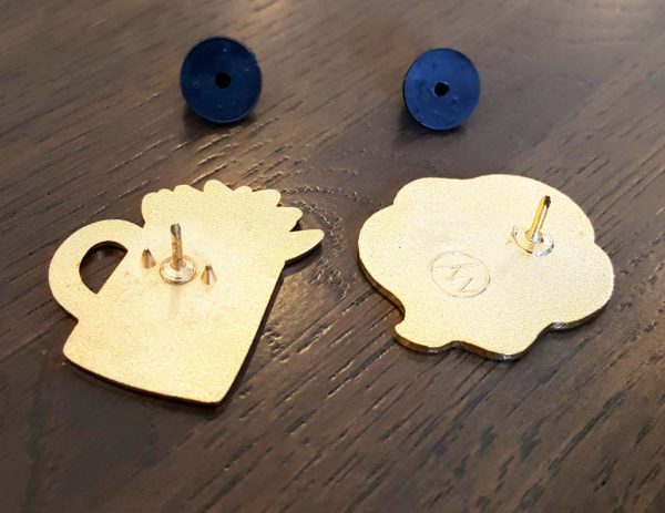
Metal backs are probably the most well-known to the general public. They’re also called butterfly clasps/clutches and have those two little tabs you have to squeeze together to take the clasp off. But we all know those two tabs aren’t particularly secure. Sometimes you can rip a metal clasp right off without touching the tabs. Or was that just my childhood experience?

[]

Rubber backs, on the other hand, are a very simple piece of rubber with no intricate workings. All they require is a simple pull or push.

The first enamel pins I bought had rubber backs. Initially, I thought they were just cheaper to produce. But when I started making pins for myself, I found that no manufacturer (that I’ve come across so far) charges a different price for rubber or metal backs.

I ended up snooping, asking around, and Googling to find out, what’s the difference between rubber and metal backs? Is one better than the other?

Meanwhile, being already biased toward rubber and finding insufficient information online, I chose rubber backings for my first pin and pin set. All of my current pins have rubber backs.


Which is Better: Metal or Rubber backings?

I do have opinions on this topic now, not just a bias toward my first type of pin backs. But spoiler alert, the difference between metal and rubber backs comes down to personal preference.

The majority of pin makers I’ve purchased from use rubber. But I’ve heard others express a strong preference for metal. A few creators offer both. And while one isn’t definitively better than the other, there are definite pros and cons to discuss.


Metal Pin Backs

Other names: butterfly clasp, metal clutch, butterfly clutch, military* pin back, military butterfly clasp

Pin Backing Types Metal Butterly backs

Pros:

  • Metal backs on metal pins look more uniform
  • Butterfly clasp provides a slight lock
  • Better for securing pins on thicker material
  • Can customize metal color

Cons:

  • Doesn’t provide a tight fit or secure lock
  • Butterfly tabs can get caught in hair and clothing
  • Metal colors are limited

Summary:

Metal pin backs have the noticeable benefit of looking more uniform. Some people view them as more aesthetically pleasing. Metal backings can be customized to a limited extent by metal color. I have butterfly clasps in gold, silver, and rose gold. But typically no one will see the clasp except you. On the other hand, you do need to deal with the possibility of your clasp getting caught in hair, clothing, or scratching your skin.

The more important consideration for pin backs is security. Some people complain about how easily their metal pin backs have fallen off, while others report having no problems. Compared with rubber backs, butterfly clasps have a looser fit; they’ll never be completely flush against the pin needle.

However, metal pin backs tend to be better if you’re frequently removing and replacing pins, like me. While the butterfly clasp mechanism can get worn down, the back ultimately holds its shape better than rubber, which will stretch with extended use.


Rubber Pin Backs

Other names: PVS rubber pin back (this one’s pretty straightforward)

Pin Backs Rubber Backs

Pros:

  • Tight fit
  • Very secure on thin or textured fabric
  • Smooth surface is skin-friendly
  • Highly customizable
  • Better grip

Cons:

  • Harder to secure on a thick surface
  • Loosens over time and with movement
  • Security varies by quality

Summary:

In general, rubber pin backs provide a tighter fit. The hole in the pin back is made to fit your pin post perfectly. Some rubber pin backs are so tight that I’ve had trouble removing them at first. But the key phrase here is “at first.” Rubber stretches over time, leaving you with a looser fit, the more you remove and replace your pin.

And although rubber backs are pretty secure, they can also loosen if you have your pin on a surface that sees a lot of movement, like a lanyard or tote bag. But if you plan to leave your pin on a surface permanently, your rubber pin back is less likely to stretch. The rubber surface is also durable and won’t get caught on hair or clothing.

Another big draw of rubber pin backs is customizability. You can choose different colors and even special shapes. I’ve seen heart- and star-shaped pin backs and of course, Disney pins have rubber backs in the shape of Mickey Mouse heads.


Finally, I’d add that rubber pin backs have the benefit of a tighter fit on fabric. All pins have one or two sharp nubs next to their pin post. When a pin is pushed completely flat against its backing card, you’ll see a little indent next to the hole from this nub. In many rubber pin backs, you can also see a faint indent or two from these “nubs.” (Sorry if “nub” sounds weird–I don’t know what else to call it.)

To get a more secure fit, from your rubber pin back, you can press your pin tightly against a fabric surface so that the nub also catches the fabric. Then press the rubber back as tightly against the back as possible to secure with both the post and the nub. If this makes no sense, hopefully these pictures will help:

A pin on the left with two nubs (mine) and a pin on the right with one nub (from Shop Lizzy)


Pin Backing Types nub imprints on rubber backs
Nub indents on two rubber pin backs; multiple on the left because I don’t always stab in the same spot


Anyway, the point is that rubber backs can give a really secure fit.


What About Locking Pin Backs?

There’s another type of popular pin back on the market. No post on the different types of pin backs would be complete without it. They’re locking pin backs.

In the end, rubber and metal pin backs don’t have a significant difference in security. It’s possible to lose pins with both backing types. So collectors turn to locking pin backs. I’m not focusing on this type of pin back because a.) I’ve never used them and b.) they’re in an entirely different league. But I’ll take a moment to share what I know.

Locking pin backs are also called locking clutches, deluxe pin backs, spring-loaded clutch backs, or military pin keepers.

*I would assume these are the true “military pin backs” but I’ve seen people refer to both regular butterfly clasps and locking pin backs as “military.” So just make sure you’re seeing a picture before you purchase any “military” pin backs.

Locking pin backs come in two variations: flathead and ball head pin backs. They look exactly how they sound and function in pretty much the same way. In order to lock your pin into place, these pin backs have a spring, which you release by pulling the top (flat or ball) up while pushing the bottom of the back down at the same time. If this sounds confusing, here’s a quick YouTube video and one with a longer explanation.

Some locking pin backs require you to open the spring whenever you want to put the clutch on or off. Others just need a firm push to put on and a squeeze only when you want to take the pin back off. Apparently there’s a bit of a learning curve; you may need a few tries to get used to releasing these pin backs.

Locking pin backs are more costly and in most cases, you’ll need to purchase them separately from your pins. I definitely plan to try locking pin backs someday…but for now, I’m spending my money on new pins.

(And if you’re thinking I sure had a lot to say about locking pin backs for someone who’s never used them, well, my cheap research skills are top-notch. I once had a sketchy job writing product reviews for items I’ve never even touched. Don’t trust everything you read online folks.)


Which Do I Prefer: Rubber or Metal Pin Backs?

Although I’ve only used rubber backs for my pins so far, I’ve recently been tempted by metal. So much so that I’ve ordered butterfly clasps for my next batch of pins (currently in production). I’m not set on metal, but recently I’ve come across a problem with my rubber pin backs.

I move my pins around. A lot. Especially my sample set of succulent pins. I’m constantly sticking them in different places to take pictures. As a result, the backings have gotten noticeably looser.

Meanwhile, I have some pins from a friend that use metal pin backs. To be honest, these butterfly clasps are a little difficult to remove. I have to pinch the butterfly tabs and jimmy it around a bit to remove them. But those pin backs are SECURE. Even with the amount of traveling these pins have done from one surface to another, these pins still stick.

So forget my worries about branding and consistency; I’m testing out metal pin backs. Maybe in a few months time, I’ll have a clear favorite, but for now, I’m still on the fence.

Pin Backing Types Metal vs Rubber on Pins


Do you have strong opinions on pin backs? This is a super serious topic! Feel free to fight it out in the comments!

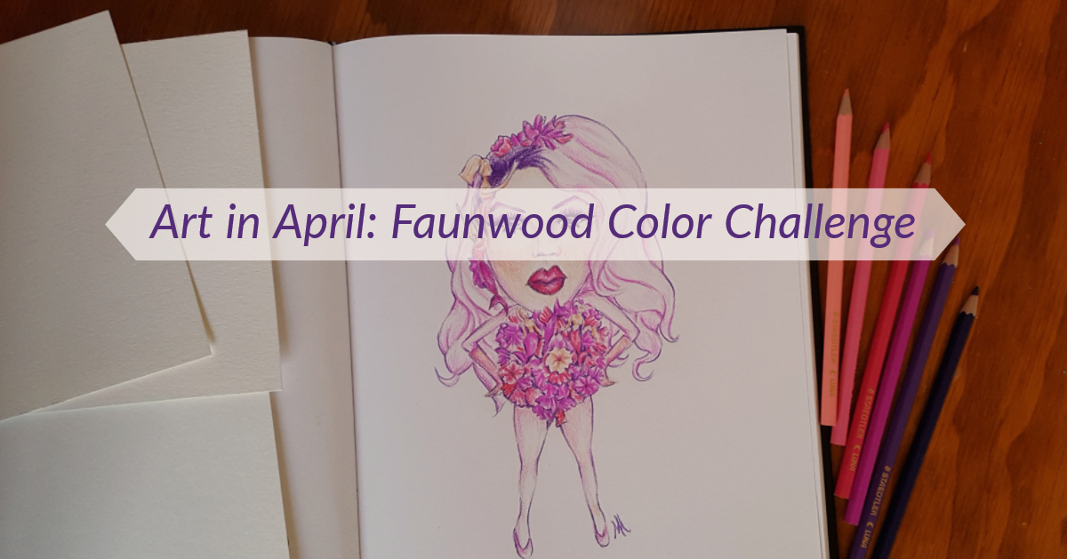
April Art Challenge Title card


During the month of April I participated in Faunwood’s April Art Challenge – a 30-day art challenge created by artist Miranda Zimmerman. Before you get too excited for me, just know that this was an informal art challenge that anyone could join. No awards or anything like that!

Zimmerman chose 30 prompts with the intent of practicing color. To use color was the only guideline, other than that, the prompts were up for your interpretation. Although we’re talking about artists here, so I wasn’t surprised to see a few black and white pieces throughout the month.

April Art Challenge - AprilColorsChallenge prompts


I took a look, decided the prompts seemed fun, and grabbed my pencils. Colors are an area of weakness for me too, so this challenge seemed perfect.

At this point, I should mention that Miranda Zimmerman does absolutely lovely black-and-white illustrations with a sort of dark, fantasy + nature theme. I definitely recommend checking her work out.


April Art Challenge…Start!


“I’ll do this but I won’t be too hardcore” was the theme of this challenge. After finishing Inktober last year, I knew I wasn’t ready for that level of commitment.

I started the challenge on time and made it about halfway through the month, and produced 16 pieces of art. I confess without shame that this number includes days when I combined multiple prompts to catch up. Whoops!

Overall the challenge was fun and I came out of it with a nice series of Ghibli patterns. For your viewing pleasure, here are my pieces from Faunwood’s April art challenge:


Day 1: A Dang Bunny, Obviously

The first day of the month was both Easter and April Fool’s Day.

I sketched out some stylized rabbits and then attempted to use this cool notebook made with Lokta plant leaves. Apparently it was handcrafted by a Fair Trade Women’s Co-op in Nepal and uses eco-friendly paper making methods. I also used this notebook for Inktober. Sadly, it didn’t take color very well.

The paper is super absorbent and has a delicate textured surface. Colored pencil (the body of the bunny) didn’t work because I couldn’t put much pressure on the paper without scratching away the surface of the paper. So I tried working with markers. They bled. Then I think I then added water to spread the color more evenly?

I finished the rabbit. That’s what matters.

Day 2-3: Analogous Color Palette/Pink as Shadows

Fortunately I was delayed but not deterred by the first day. After watching the first episode of RuPaul’s Drag Race Season 10, I had to do Miss Vanessa Vanjie Mateo‘s now iconic look.

April Art Challenge - 2 Miss Vanjie in progress
Miss Vanjie…

I chose two somewhat tricky prompts to combine, but the challenge (plus the indignity of Miss Vanjie going home first) fired me up.

…Miss Vanjie…

For my analogous color scheme (where you use only colors that are next to each other on the color wheel), I chose purple, pink/red, and a little bit of peach/orange. To stay within this color scheme, I took a few liberties with Miss Mateo’s look and used purple instead of blue for makeup and made her hair pink instead of blonde.

…Miss…Vanjie

I don’t know how she went home first, with those fun but slightly creepy mermaid Barbies scattered throughout her outfit. We better get more Vanjie in the future.


Day 4: Spores

By comparison, day four was rather dull for me. I added some of my little figures to give the piece a little more life. They’re a father and his two kids in the mushroom spore rain.

Day 5: Parasite

Here’s where I decided to draw what I wanted but try to tie it into the prompt. Studio Ghibli pins were (are still are) exploding in the enamel pin community and I caught the bug too. Hence this page of the tiniest Totoros from My Neighbor Totoro. These fit the prompt because…they would be super adorable as parasites and could easily take over the world.

Day 6: Gold/Silver

I was still in a Ghibli mood, so No Face (Spirited Away) with his fake gold came next.

Day 7/8/9: Gouache/Split-Complementary Color Palette/Mixed Media Insects

Ghibli again, but this time I combined three prompts! These are Ohmu or giant fantasy bugs from Nausicaa: Vally of the Wind. This movie was all about climate change before the general public even thought it would be an issue. It’s lovely, but then again, all Studio Ghibli films are.

The Ohmu are painted with gouache – a paint that’s very similar to watercolor, but a bit more opaque and easier to mess with on paper. I hadn’t used gouache since an intro art class in college, but still had a few tubes lying around. I ended up loving gouache. You’ll definitely see more gouache from me…once I find where I put those paint tubes again.

A split complementary color scheme involves choosing one color (i.e. orange), then taking its complement (directly across the color wheel from orange is blue – think Denver Broncos), and instead of using the complement, you take the two colors next to it (blue-green and blue-violet, or if you prefer just green and purple). So my color scheme was roughly orange, blue-green, and blue-violet. You can see that I didn’t stick too closely to these colors, but they’re in the ballpark.

Finally, to fulfill the “Mixed Media Insects” part of the prompt, I added pen outlines. Partly because I felt guilty about combining so many prompts, and partly because I enjoyed using gouache, I did three more mini paintings.

Two of the three mini paintings and some sketches

Day 10: Brambles

Then for the next four prompts, I got really lazy. These were all quick digital sketches done on my phone, all in the same day. Although I didn’t spend much time on each, just the act of sitting down and taking the time to make art felt so good this day.

I went literal with “brambles.” This was my warmup.

Day 11: Mineral/Crystal

Literal once again. An amethyst was the first crystal I thought of. An in-depth study of crystals would be really great for practicing  both color and light though.

Day 12: Earth Tones

I immediately went to the mountain landscape I draw often, inspired of course, by my everyday view of Pikes Peak.

Day 13/14: Color Matching from Life/Digital

And in case you were wondering what that everyday view looks like, I chose Pikes Peak once again for the color matching prompt. The colors were much darker than what I would usually choose when painting Pikes Peak and Garden of the Gods, but the end result looked richer too.

Pikes Peak and Garden of the Gods phone speedpaint

Here was the reference photo I used for color matching.


Day 16: Floral/Plant Study

I skipped Day 15 (Iridescence) and went straight for plant study. By the time I started this prompt, I’d already decided it would be my last. I took three succulents I’d recently beheaded and used them for my color study.

Unfortunately, I did these color studies at night in my dimly lit room. When I saw them in natural light the next day, the colors looked pretty different!

Extras

While I didn’t complete any more prompts, I went on to do two more Ghibli pages in the same style as the first three.


Soot sprites from Spirited Away


Ponyo sisters with jellyfish (Ponyo)

Keep an eye out – you may see these designs again in the future!

Are you thinking of applying to graduate school?

Whether you’re hoping to gain new skills or just need a break from the “real world,” we’re all equal on the application playing field. (Except when it comes to financial barriers, support structures, and your overall social and cultural capital. Lol. But what is this, a social justice piece?) We all owe our share of blood, sweat, and tears.

That’s where I come in. As a person who applied to graduate school just last year, I am now a certified expert. You’ll find that I am uniquely qualified to guide you through the process and can 1000% guarantee AT LEAST a 0% acceptance rate. You can’t get numbers like that anywhere.

So kick back while I reveal the inner workings of the graduate school application system: Sociology Ph.D. edition. This guide was created from real world data AND is mostly pictures. You can’t get that from GradCafe, can you?

The Art

When you embark on your grad app journey, you might think your goal is to get accepted somewhere. But don’t put that pressure on yourself. All you need to do right now is GET IT!

The following is a list of 10 easy steps to help you GET IT!


Step 1. Get pumped.

You’ve decided what you want to do with your life, to a certain extent. You’ll be going to school for the next few (or several) years. It’s going to be everything you’ve ever dreamed of.

applying to grad school comics: excited woman in a pink sweater imagining what graduate school will be like


Step 2. Get overwhelmed.

Okay, this is harder than you thought. Realize you have no real criteria. You just want to go somewhere good. And you know there should be faculty you want to work with. That seems clear enough until you start looking. How do you define “good” exactly? And do you really need to look through every single faculty member’s web page?

applying to grad school comics: woman at a table in front of a laptop looking frustrated


Step 3. Get help.

Connections are a thing. Your former professors know a lot of things. Conversations are good. Apparently you’re lucky that you can use websites and not microfiche. After some pointers, it’s back into the trenches for you.

applying to grad school comics: illustration of two women talking at a table. Woman facing us has two thought bubbles showing her true emotions


Step 4. Get choices.

You’re now a master at navigating sociology department websites. Except NYU. Theirs is confusing every single time. You have your top choices. Your list of schools is starting to mean something.  But let’s be honest, there are multiple lists, and Word docs, and excel spreadsheets. Organization is a farce.

applying to grad school comics: three simplified figures with a placards that represent different schools. The first school is a yes, the second a no, and the third simply has a question mark.


Step 5. Get worried.

That deadline is sooner than you thought. Did you ask for rec letters yet? You’d better hope that last professor says yes.

applying to grad school comics: woman sitting in front of a laptop looks stressed. Papers, notes and writing utensils litter the desk. The upper right corner reads "Dec 1" in green dripping font.


Step 6. Get to work.

Your letter writers want a draft of your personal statement? Let them know it’s going to messy af. Write that in a hurry. Then agonize over your CV. And statements. And the difference between a personal statement and a statement of purpose. And the arbitrary (lack of) standards between programs. Couldn’t they all have agreed on a standard definition, for your sake?

And that program asking for two statements? Who do they think they are? (A top school, that’s who.)

applying to grad school comics: woman in the center of an illustration mimics pose from the painting "the scream". Background is a green swirl with objects like papers and coffee in it.


Step 7. Get those first applications submitted!

Triumph at last! You feel a swelling sense of accomplishment followed by a creeping …concern. Its name is The Next Deadline. How much do you really need to tailor your statements to each school?

applying to grad school comics: happy woman in a silver gown occupies the center of the illustration surrounded by yellow sparkles. The background shows a "Submit" button being clicked with a computer mouse.


Step 8. Get to work overachiever.

You tell yourself this next round of applications will look even better than the first. You turn into an editing monster. But you really can’t tell if there’s a difference.

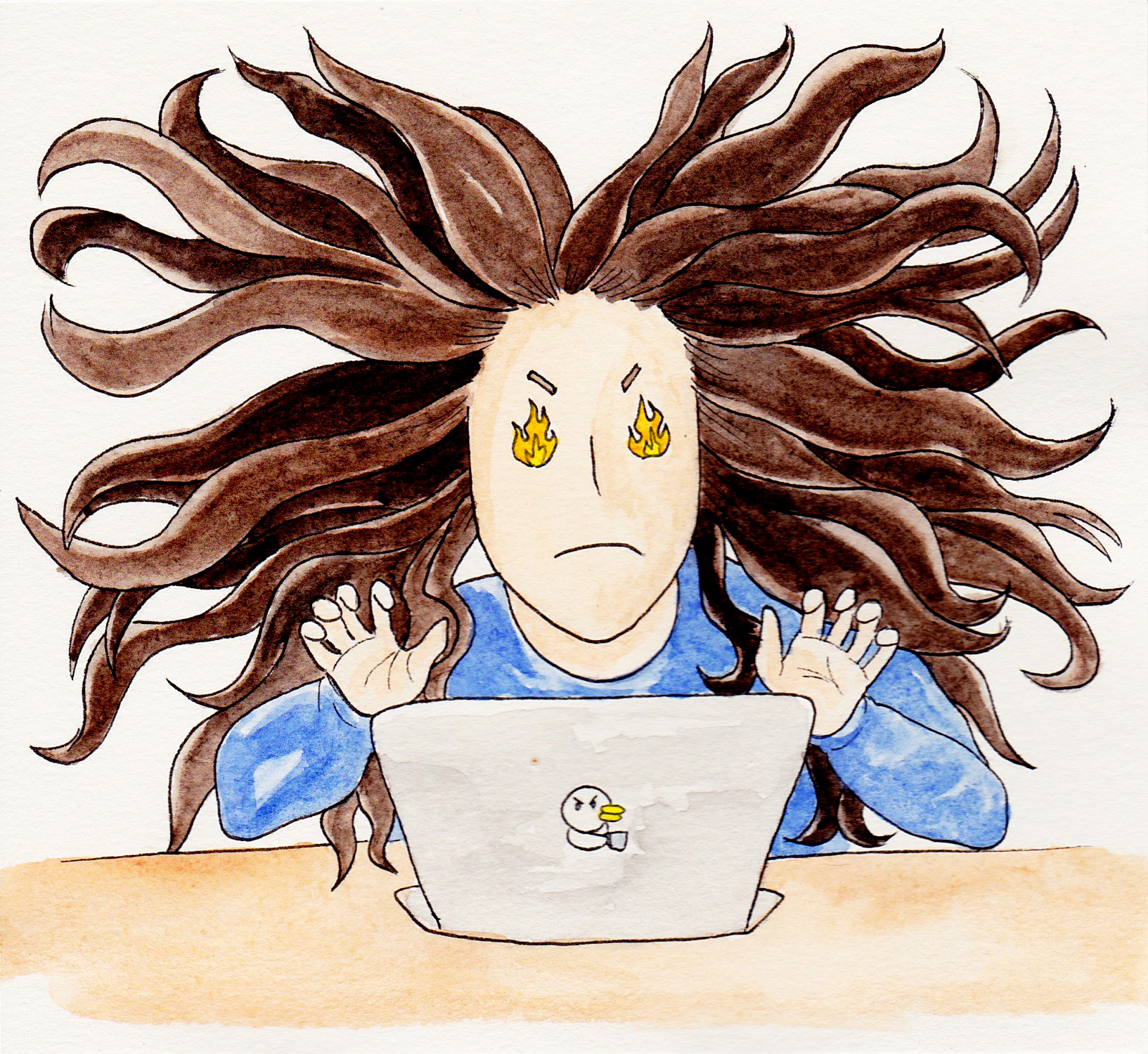
applying to grad school comics: woman sits in front of a laptop with fire for eyes and medusa-like hair flying in every direction


Step 9. Get over it.

The other deadlines rush up in no time. You submit your work rather uneventfully and suddenly the whole process is DONE. You feel a little empty. Grad school applications have drained you of everything. Promptly forget about them and move on with your new, application-free life.

applying to grad school comics: woman in a red sweater, glasses, and dark brown hair pulled back in a bun walks through a background resembling a child's illustration with grass, flowers, and an apple tree


Step 10: Get…Accepted?

React with shock when a school gets back to you far earlier than expected. Exclaim out loud that you’re not ready to find out yet! Then mash your finger against that screen immediately while holding your breath.

applying to grad school comics: the top of a smart phone screen shows that the user has received an email from "A University" regarding her admissions decision. In the foreground, a woman closes her eyes while reaching out to open the email on her phone.


Note from the Real Author

Hello everyone, Monica here.

Hope you enjoyed these illustrations. This was my real life at the end of last year. This is also my way of announcing that I’ll be heading to graduate school this fall. For the next 5 to 7 years, I’ll be attending a Sociology PhD program at Indiana University Bloomington.

I’m excited to finally be taking this next step, but don’t worry, you’ll still hear from me on this blog. Figuring out how much time I can dedicate to art and blogging in my first year of grad school will be an adventure. But nothing new.

Fitting art into the cracks is just part of any non-full-time artist‘s life. I’ve made my peace with it.

See you again next week,

Monica


Kickstarter isn’t always convenient. It takes a lot of time. The funding isn’t guaranteed. You need to follow the Kickstarter’s requirements to get approved and pull off a successful campaign. And then you need to give Kickstarter their cut. It’s not surprising that many creators would rather stay away.


Preorders as a Way to Fund

Many artists in the enamel pin community open preorders. But generally, preorders don’t perform well unless the artist is well-known and/or there’s a good discount included. From what I’ve seen, preorders aren’t a good way to gather funding for production.

But there’s another beast known as “necessary preorders.”


What is a Necessary Preorder?

I’ve only seen necessary preorders pop up in artists’ shops recently.

Necessary preorders require a certain number of orders before the project can go into production. The seller will only run necessary preorders for a set period of time. If they don’t receive enough orders by the deadline, the project will not be made and all customers will have their orders refunded.

It’s essentially an independently run Kickstarter. For many products, Kickstarter and other crowd-funding platforms act as preorder facilitators. Yes, backers may help bring a product to life, but in most cases, they expect to receive the product as well.

A necessary preorder is arguably more transparent in being all about the product. Naturally, there are several reasons why you might consider a necessary preorder and several reasons you might not.


Benefits of a Necessary Preorder


You retain control.

On your shop website, you run the preorder campaign any way you want. There are no limitations to the rewards you can offer to customers, no set formula to follow, nor any obligations to continually update your project.


No fees.

Because you manage the entire process yourself, you don’t owe fees to anyone. Every cent you make can go directly into your project. Plain and simple.


Flexibility

On a crowdfunding platform, you’re tied to a specific funding goal and deadline. But on your website, funding a project quickly means you can access your funds immediately and get your product into production faster.

Timing is also up to you. If you don’t quite meet your goal by the deadline, you might choose to wait a day, make a final promotional push, and encourage a few more preorders. Or you might decide to foot the rest of the bill yourself and start production. While having this flexibility is nice, be sure to communicate clearly with your customers so you don’t come across as unreliable. This leads in nicely to the potential drawbacks of running necessary preorders.


Drawbacks of a Necessary Preorder


No established platform to drive traffic to your preorder campaign.

Whenever you fundraise on a platform, you benefit from the built-in audience that comes with it. My Seasonal Succulents Kickstarter received 46% of its pledges from people who discovered me through Kickstarter. If you choose to run a preorder campaign on your own, you don’t receive the perks of additional traffic from a platform.


More marketing required for you.

You need to put more effort into two levels of your marketing efforts: design and traffic. Naturally, you need to do extra promotion to get the same amount of visibility that your project would have received on a crowdfunding platform.

But you also need to consider the layout of your preorder page. Kickstarter comes with a pre-built structure designed to lay out the details of your project clearly and concisely. Backers are usually familiar with Kickstarter’s layout too, so they can quickly find the information they need.

Your necessary preorders need to be displayed prominently and made distinct from any regular products. If your preorder is listed just like any other product, you risk visitors glossing over it or misunderstanding its purpose.


You have the burden of more perceived risk.

Crowdfunding platforms don’t just come with an audience. They’ve also established trust with consumers. Most online consumers have heard of sites like Kickstarter, Indigogo or GoFundMe. If your project doesn’t get funded, visitors know the site is reputable and can count on receiving their money back.

When purchasing a necessary preorder, the consumer has to trust you as an individual business. This is an additional and perhaps the most significant barrier to a purchase. Ways you can reduce this barrier include showing a clear track record with positive reviews, similar products, and successfully funded projects in the past.


Tips for Running a Necessary Preorder


  1. Be crystal clear.

Necessary Preorders Water Drop Crystal on a rock

Ensure everything is crystal clear from the start. There are many opportunities for visitors to misunderstand or misinterpret your project. Necessary preorders simply aren’t very well-known. If you don’t believe me, just do a Google search. Marketers aren’t even talking about necessary preorders yet (or if they are, their SEO is too low to show up in search engine results).

You don’t want users misunderstanding and expecting your preorder product to be sent out immediately. Take care to also explain that the project is not guaranteed to be funded. Customers should be sad, but not shocked if your project doesn’t make it.

Regardless of the outcome, the most important point you’ll want to stress is what happens with their money. Clearly state that if a project isn’t funded, you’ll completely refund everyone’s orders. It wouldn’t hurt to mention this multiple times. You want to emphasize that funding this project carries no risk for your customers.


  1. Consider your timing.

Necessary Preorders old antique clock on rocky ground

Choose the right length of time. This is easier said than done. You’ll want to choose a time frame that isn’t so long that your customers get sick of waiting and pull out. But your preorder period can’t be so short that you don’t have enough time to promote your project. Give people time to find your project and be clear about your deadline.

There’s no single “best” length of time for a necessary preorder. This will vary by the nature of your project and your reputation as an artist. Do you already have an extensive network and social media following? Or will you need more time to reach enough members of your target audience? Expect some trial and error. The default for Kickstarter projects is about one month.


  1. Social media is your friend.

Necessary Preorders: Smartphone that has blue screen with the word Social on it, faces, and various social media icons, laid on top of a white keyboard

Since you need to promote your preorders even more than you would on a crowdfunding platform, use social media to your advantage. You can find just about any audience on social media. Even businesses who target consumers aged 65+ use Facebook.

Connect with your following. Ask them to support your project, if it’s of interest to them and ask them to share for a snowball effect. While you could do extensive research into what makes for effective social media marketing, here’s a crash course.

  • Create fun, interesting, and relevant
  • Use images and video.
  • Post consistently.
  • Craft attractive headlines.
  • Don’t forget to include an ask (CTA) in your posts.


  1. Create a community.

Necessary Preorders: Light and dark blue speech bubbles in a cluster

People enjoy the community aspect of crowdfunding projects, but you don’t need to use a platform to encourage community. On social media, email lists, or in-person, communicate with your customers and followers. Although you’re not obligated to provide updates, your customers will appreciate being kept in the loop. There’s a sense of progress that comes with project updates. They can also double as promotion opportunities to remind people about your project and generate more excitement.


  1. Give evidence of past success.

Necessary Preorders: magnifying glass on old book

We touched on this when we talked about risk, but don’t be shy about showing off your past successes. A strong track record goes a long way, whether in the form of concrete numbers or social proof. Numbers you can highlight include number of sales, past projects you’ve successfully funded, or existing products that are similar to your necessary preorder.

Social proof brings in others and has more weight than your own word. You’ll want to provide evidence of satisfied customers in the form of positive ratings and reviews. Another powerful way to accumulate social proof is by partnering with bloggers, social media influencers, or media outlets. Coverage of your product, specific project, or business as a whole builds trust with your target audience.


Necessary preorders can be a helpful, independent way to fund your projects. But they require a lot of groundwork and additional promotion, particularly for small businesses. Have you tried necessary preorders for yourself? If so, what was your experience?


Kickstarter projects are all or nothing. If a project doesn’t reach its funding goal, it’s canceled and backers never see pledges taken out of their account. But in my first Kickstarter, I received funding for 2 out of 4 pin designs. How?

I used stretch goals, but perhaps not in the way Kickstarter intended.

The crowdfunding venue distances itself from stretch goals as not being an official part of the platform, but acknowledges their existence and value. But now creators are using stretch goals differently.


What is a Stretch Goal?

Kickstarter defines a stretch goal as “a funding target set by the project creator beyond the original Kickstarter goal.” These additional funds often add perks or upgrades to the existing project, like improving binding on a self-published zine or higher quality game pieces for a board game. They may also be separate from the project. Extra stickers, a free pin, or a bonus comic strip are all stretch goals I’ve seen creators offer.

That’s not the kind of stretch goal I used. I’m talking about stretch goals as a way of running a Kickstarter project.

Most projects on Kickstarter have one clear goal. They either get enough to print 500 copies of that comic book, record and produce that album, produce a revolutionary new type of ramen…or not.

Smaller projects are different. If your goal is to produce a set of 10 enamel pins, you could take the all-or-nothing route too. All 10 pins or nothing! Risky, but that’s the nature of Kickstarter.

But what if instead, you could collect funding for just some of the pins? And you didn’t have to meet your end goal to put some pins into production?

That’s the mindset behind using stretch goals for your entire campaign strategy, rather than just the extras.


How Does a Stretch Goal Based Campaign Work?

Rather than just write about it, let’s look at two examples. First, take my finished campaign.


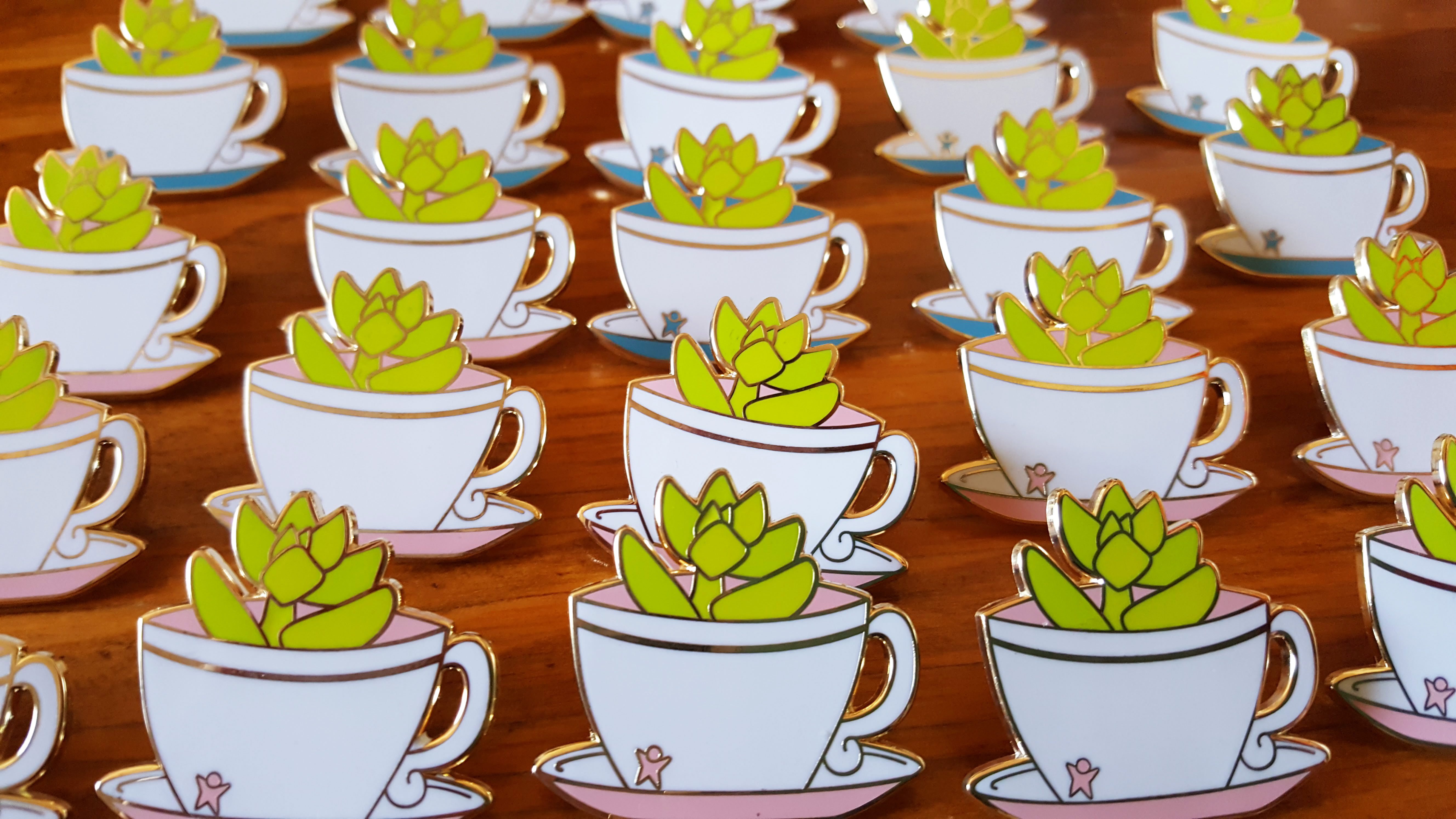
A screenshot of my completed Kickstarter campaign, featuring an image of my 4 succulents in cups designs (with 2 additional color variations for a total of 6 pins)
My Completed Kickstarter Campaign

I planned to create a set of four succulent pins based on seasons. I set my initial goal at $200 to cover the cost of a single pin. Being my first Kickstarter project, I wasn’t confident that I could get all four pins funded. Setting the official funding goal for only my first pin design was less risky. Nothing is guaranteed in a Kickstarter campaign of course, but I was much more likely to raise $200 than $1000.

I launched my project on March 5th and successfully funded the first pin March 12th – in exactly one week. And it turns out, stretch goals were the right call. The second pin design was barely funded – right before the project ended on March 28th.


A screenshot of Reboops' Kickstarter project for 20 Overwatch-inspired enamel pins
Reboops’ Overwatch Pins Kickstarter

Now let’s look at a couple of on-going projects. My good friend Reboops just launched her third (!!!) Kickstarter campaign. She’s aiming for a massive set of 20 pins based on characters from the game Overwatch.

As of this writing, she’s funded 11 pins (out of 20). Like my campaign, her initial goal was only set for a single pin. In this case, she isn’t planning any stretch goals beyond the set of 20, but has added extra pin designs to previous Kickstarter campaigns as she met her original goals.


A screenshot of Shirley Jackson's Chinese Zodiac Animal Kickstarter, featuring an image of 3 pins: Horse, Sheep, and Monkey
Shirley Jackson (Lioninthetrees)’s Zodiac Animal Pin Kickstarter

Do all pin Kickstarter projects work this way then? No, and Shirley Jackson’s Chinese Zodiac enamel pins are a great example of a more traditional approach to a project. In this series, she aims to fund three pin designs and 12 zodiac animal screen prints.

Her stretch goals include two different color variants and an extra enamel pin (related to the Chinese Zodiac story). Although these are “stretch goals,” they’ll definitely get funded. This project was just released this morning but has already met its main goal! But I absolutely love Shirley’s work, so I can see why.

Update: A couple hours later and all but the final stretch goal has been funded. Woah.

Update #2: All stretch goals funded before I could get this post online!


Full Funding Goals vs. Stretch Goals

While traditional campaigns aim to fully fund a project, stretch goal-based campaigns fund a project in steps. Neither is necessarily better than the other, but naturally, they both have pros and cons.

Full Goal Pros:

  • Crystal clear goal
  • Easy to understand
  • Less likely to have unexpected costs/insufficient funds


Full Goal Cons:

  • Higher risk
  • Greater possibility of no funding

Running your campaign with your full goal as your official goal doesn’t have any significant advantages or disadvantages. It’s simply the default. Your audience will see exactly what your goal is, with no opportunity for confusion. You also inherit the all-or-nothing risk that’s inherent to the Kickstarter platform.

If you truly need the full amount of funding for your project, or you aren’t willing to create only a part of your project, use full goal funding.


Stretch Goal Pros:

  • Higher chance of success
  • Less risk
  • Good for risky or less popular projects
  • Generates excitement throughout the campaign

A stretch goal set-up is perfect if your project is flexible and you’re unsure about your chances of success. A project targeted to a very niche audience, a relatively new creator, or a project where the first goal really is your primary goal are all good candidates for stretch goals.

With your initial amount set far lower than your full project goal, you’re far more likely to guarantee some amount of funding.

But one of the most notable but overlooked benefits of running a stretch goal-based campaign is excitement. Traditional projects have two high points: when your project is fully funded and when the campaign ends (and the project begins).

Stretch goals create several high points throughout your campaign. After meeting your first goal, backers can still look forward to the next goal or their favorite one. But note that this only works if you’re consistently meeting stretch goals throughout the campaign.


Stretch Goal Cons:

  • Less urgency once you’ve met your official goal
  • Partial funding may not be enough for actual costs

When planning a campaign based on stretch goals, not getting fully funded is a definite possibility. So be sure to set each goal high enough for each additional reward. When I give this warning the example I have in mind is my own campaign.

Because my campaign barely hit my second goal before it ended, I was able to offer that my second pin design to backers. I’m really glad I could. But on that last day, one person canceled their pledge. Kickstarter didn’t change the total amount to reflect that dropped pledge, so in reality, when funds came through, I’d actually raised a total of $389 and after Kickstarter fees, received $353.

On one hand, I’m glad my second design was “officially” unlocked and I could but it into production right away. But the funds just covered manufacturing costs, and I was left to cover remaining expenses like shipping myself. That’s the kind of oversight that I expect would be less likely with a full goal Kickstarter.


In the end, one type of campaign isn’t better than the other, but they suit different needs.

If you have a project (like enamel pins) that can be broken up into smaller goals and don’t necessarily need to be released as a complete set, a stretch goal-based project will work just fine.

But if your project needs the total amount of funding to be successful, can’t or shouldn’t be split into parts, or you want to manage a simpler campaign, full goal funding is the way to go.


Banner of 7 plant pin designs. From left to right: zebra plant in a red pot, golden sedums in blue and pink teacups, sedum in a glass, sedum in a paper coffee cup, and 2 sedums in blue and purple mugs

Last month I started my first Kickstarter campaign. I shared, promoted, and actually created a content strategy to get the word out. And it was successful!

Last week, I finished shipping out Kickstarter rewards. Unless there’s a problem with any orders, the process is over. That batch of 20-some Kickstarter rewards was technically my second art sale. Thinking about it that way, a Kickstarter may have been a bit premature. But I’m glad I tried it and naturally, I learned a lot.

There were several little moments of excitement and accomplishment throughout the process: getting my first backer, getting more backers, anytime I got a backer actually, and then figuring out and successfully accomplishing the logistics.

Before I address what I learned from running a Kickstarter, I thought I’d go into why I decided to start a Kickstarter project in the first place.


Why Start a Kickstarter?

Other than for the money? I decided to venture into the world of crowdfunding because:

  • Pins are expensive
  • Pin makers run successful Kickstarter campaigns all the time
  • Pin sets are far easier to produce at once with some support

Kickstarters are common in the pin creator community. First, seeing all these pin makers on Instagram showed me it was possible. For me, this occurred at two levels: in the abstract, seeing pin makers I follow online, and in person, as one of my dear friends successfully ran two massive (and massively successful) Kickstarter campaigns.

Crowdfunding also felt like the best way to produce a set of pins. But there’s another benefit that I didn’t know about at the time.

Kickstarter projects generate excitement and urgency. I’ve experienced this as a backer, but there’s a sense of pride in being able to bring a project to life with your purchase or donation. Kickstarter creates a community in a way that preorders in a shop cannot. As a backer, or someone on the fence about backing, you can follow along with a project’s progress and if it’s successful, feel like you too had a role in that success. Which, well, if you backed it, you did.

While running a Kickstarter was fun and exciting and new, I definitely feel a sense of relief now that it’s over. My campaign funded two out of four pins in the series. I’m satisfied, but looking back, there are certainly things I would have done differently.

6 succulent pin designs on a purple gradient background. Designs feature succulents in different cups: teacup, glass, paper coffee cup, and mug

Lessons from My First Kickstarter

Remember how I said this Kickstarter was only my second art sale? Yeah. In retrospect, I might have told myself, hey, isn’t it a bit soon to be running a Kickstarter? Maybe it was. But it also turned out fine.

That doesn’t mean I would repeat the process as is. Here’s what I learned:

1. Build Your Audience First!

Here’s how I began my campaign. I created my Kickstarter project and set my campaign period shorter than the default amount (because I’d read/heard that shorter campaigns tended to do better and I was impatient). Then after the project was already underway, I began reading up on how to run a successful campaign. And the one thing all experienced creators were saying was to build up your audience first.

Whoops. I suppose I’d been trying to do a little network-building by creating and building up an art Instagram account. But my following was and still is moderate. If I’d heard this bit of advice first, I would have waited before starting a campaign. Or worked harder to build a large following.

2. Set Higher Funding Goals.

I remember once finding a Kickstarter project to fund a single pin that was listed at $900. $900?! I could produce at least four pins at that price! I set my own project goals at $200 per pin, a very reasonable amount, I thought.

Reasonable, but maybe not for Kickstarter. While I knew about Kickstarter’s fees and thought I’d factored them into account, other costs added up too. In case you’re wondering, Kickstarter charges a 5% fee plus payment processing fees (3% + $0.20 per payment). I didn’t make the mistake of not charging for shipping, but I severely underpriced international shipping costs. This one’s (halfway) on me, international buyers!

There were also multiple components of the packaging that I hadn’t considered. Bubble mailers, individual pin packaging, backing cards, business cards, label sticker paper, and shipping labels all cost something. I haven’t calculated what the actual cost per person came out to yet, but I know it was more than what I charged.

Moral of the story: $900 for a one-pin Kickstarter project isn’t so unreasonable after all.

3. Get Your Packaging Ready Early.

I started out with a rough idea of how I wanted my packaging to look. But I was slow to actually purchase the supplies. This was a mistake because I couldn’t just go out and buy everything in a single afternoon. Everything is cheaper and comes in more colors online. I wasn’t even able to find all the parts I wanted for packaging at local stores. So when my pins arrived a little early, I was still waiting on pieces of my packaging.

While my orders didn’t experience a delay because the pins arrived earlier than expected, it would have been much easier to get everything together early.

4.. There’s a Payment Processing Period.

Bonus tip! After your Kickstarter project is successfully funded, there’s a 14-day payment processing period. Fortunately, I learned about this through a friend before my campaign ended. Because my project was relatively small, I ordered from my manufacturer before receiving my Kickstarter funds so it wouldn’t be as long of a wait.


Kickstarter has its place, but I don’t plan to run another campaign anytime soon. But creating a Ghibli pin set does look like fun…