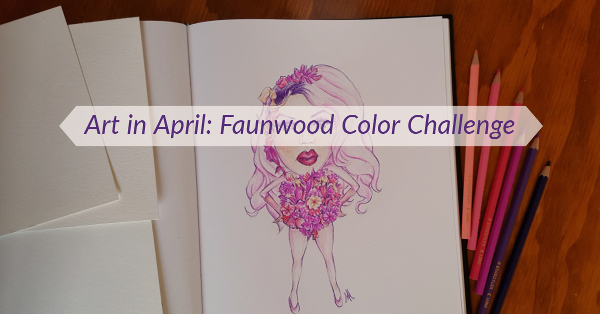
During the month of April I participated in Faunwood’s April Art Challenge – a 30-day art challenge created by artist Miranda Zimmerman. Before you get too excited for me, just know that this was an informal art challenge that anyone could join. No awards or anything like that!
Zimmerman chose 30 prompts with the intent of practicing color. To use color was the only guideline, other than that, the prompts were up for your interpretation. Although we’re talking about artists here, so I wasn’t surprised to see a few black and white pieces throughout the month.

I took a look, decided the prompts seemed fun, and grabbed my pencils. Colors are an area of weakness for me too, so this challenge seemed perfect.
At this point, I should mention that Miranda Zimmerman does absolutely lovely black-and-white illustrations with a sort of dark, fantasy + nature theme. I definitely recommend checking her work out.
April Art Challenge…Start!
“I’ll do this but I won’t be too hardcore” was the theme of this challenge. After finishing Inktober last year, I knew I wasn’t ready for that level of commitment.
I started the challenge on time and made it about halfway through the month, and produced 16 pieces of art. I confess without shame that this number includes days when I combined multiple prompts to catch up. Whoops!
Overall the challenge was fun and I came out of it with a nice series of Ghibli patterns. For your viewing pleasure, here are my pieces from Faunwood’s April art challenge:
Day 1: A Dang Bunny, Obviously
The first day of the month was both Easter and April Fool’s Day.
I sketched out some stylized rabbits and then attempted to use this cool notebook made with Lokta plant leaves. Apparently it was handcrafted by a Fair Trade Women’s Co-op in Nepal and uses eco-friendly paper making methods. I also used this notebook for Inktober. Sadly, it didn’t take color very well.

The paper is super absorbent and has a delicate textured surface. Colored pencil (the body of the bunny) didn’t work because I couldn’t put much pressure on the paper without scratching away the surface of the paper. So I tried working with markers. They bled. Then I think I then added water to spread the color more evenly?
I finished the rabbit. That’s what matters.
Day 2-3: Analogous Color Palette/Pink as Shadows
Fortunately I was delayed but not deterred by the first day. After watching the first episode of RuPaul’s Drag Race Season 10, I had to do Miss Vanessa Vanjie Mateo‘s now iconic look.

I chose two somewhat tricky prompts to combine, but the challenge (plus the indignity of Miss Vanjie going home first) fired me up.

For my analogous color scheme (where you use only colors that are next to each other on the color wheel), I chose purple, pink/red, and a little bit of peach/orange. To stay within this color scheme, I took a few liberties with Miss Mateo’s look and used purple instead of blue for makeup and made her hair pink instead of blonde.

I don’t know how she went home first, with those fun but slightly creepy mermaid Barbies scattered throughout her outfit. We better get more Vanjie in the future.
Day 4: Spores
By comparison, day four was rather dull for me. I added some of my little figures to give the piece a little more life. They’re a father and his two kids in the mushroom spore rain.

Day 5: Parasite
Here’s where I decided to draw what I wanted but try to tie it into the prompt. Studio Ghibli pins were (are still are) exploding in the enamel pin community and I caught the bug too. Hence this page of the tiniest Totoros from My Neighbor Totoro. These fit the prompt because…they would be super adorable as parasites and could easily take over the world.

Day 6: Gold/Silver
I was still in a Ghibli mood, so No Face (Spirited Away) with his fake gold came next.

Day 7/8/9: Gouache/Split-Complementary Color Palette/Mixed Media Insects
Ghibli again, but this time I combined three prompts! These are Ohmu or giant fantasy bugs from Nausicaa: Vally of the Wind. This movie was all about climate change before the general public even thought it would be an issue. It’s lovely, but then again, all Studio Ghibli films are.
The Ohmu are painted with gouache – a paint that’s very similar to watercolor, but a bit more opaque and easier to mess with on paper. I hadn’t used gouache since an intro art class in college, but still had a few tubes lying around. I ended up loving gouache. You’ll definitely see more gouache from me…once I find where I put those paint tubes again.

A split complementary color scheme involves choosing one color (i.e. orange), then taking its complement (directly across the color wheel from orange is blue – think Denver Broncos), and instead of using the complement, you take the two colors next to it (blue-green and blue-violet, or if you prefer just green and purple). So my color scheme was roughly orange, blue-green, and blue-violet. You can see that I didn’t stick too closely to these colors, but they’re in the ballpark.
Finally, to fulfill the “Mixed Media Insects” part of the prompt, I added pen outlines. Partly because I felt guilty about combining so many prompts, and partly because I enjoyed using gouache, I did three more mini paintings.

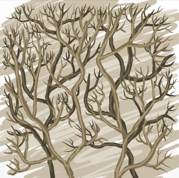
Day 10: Brambles
Then for the next four prompts, I got really lazy. These were all quick digital sketches done on my phone, all in the same day. Although I didn’t spend much time on each, just the act of sitting down and taking the time to make art felt so good this day.
I went literal with “brambles.” This was my warmup.
Day 11: Mineral/Crystal
Literal once again. An amethyst was the first crystal I thought of. An in-depth study of crystals would be really great for practicing both color and light though.

Day 12: Earth Tones
I immediately went to the mountain landscape I draw often, inspired of course, by my everyday view of Pikes Peak.

Day 13/14: Color Matching from Life/Digital
And in case you were wondering what that everyday view looks like, I chose Pikes Peak once again for the color matching prompt. The colors were much darker than what I would usually choose when painting Pikes Peak and Garden of the Gods, but the end result looked richer too.

Here was the reference photo I used for color matching.

Day 16: Floral/Plant Study
I skipped Day 15 (Iridescence) and went straight for plant study. By the time I started this prompt, I’d already decided it would be my last. I took three succulents I’d recently beheaded and used them for my color study.

Unfortunately, I did these color studies at night in my dimly lit room. When I saw them in natural light the next day, the colors looked pretty different!

Extras
While I didn’t complete any more prompts, I went on to do two more Ghibli pages in the same style as the first three.

Keep an eye out – you may see these designs again in the future!