Struggling through Art Practice: Reflections of a Sumi-e Beginner

After writing up my last post on taking a Sumi-e class, I was excited to do another at-home art session. As someone who hasn’t kept up a serious art practice since college, the idea of dedicating multiple hours to an art practice seemed a bit overwhelming. The last few years, I’ve done my art in short spontaneous bursts.

Recently, I spoke with a pastel artist at an art fair. I really liked her work and since I had a set of pastels at home, I thought I might give them another try. She recommended that I start by giving myself 3-hour blocks of time to work.

Woah, three hours? I thought to myself. I don’t have time for that. I’m constantly spinning my wheels writing and looking for more writing work; how can I just take three hours out of my work day?

Then I took that 7-hour Sumi-e class.

I’m not likely to ever spend 7 consecutive hours on Sumi-e ever again, but suddenly 3-hour sessions were feeling a lot more reasonable.

It’s funny how related experiences and pieces of information can come into your life at just the right time, in just the right combination. That’s serendipity, right? Because next I came across an article that mentioned that being busy doesn’t equate to productiveness. And boy do I understand that firsthand.

In short, all of these forces were telling me, do the art already. I can make time to do art for a few consecutive hours of my life without my freelance business falling apart.

But I still waited for Saturday.

Sumi-e Beginner title image

Sumi-e Beginner Strikes Again

Saturday morning I was ready. I excitedly took out my Sumi-e supplies, cut some paper, and ground my ink. And then…

I struggled.

I don’t know exactly what it was. Maybe everyone being at home on Saturday made the house feel too busy. Maybe it was too loud. Or I was distracted. Maybe I had my mind on other things, or maybe growth can’t always be linear.

Sure, we practice a skill and become better. And it seems like that growth is a steady, upwards path. But we forget about the outliers.

My first time doing Sumi-e at home went well. I was relaxed and easily drawing on what I’d learned, however imperfectly. I was happy with the majority of the work I produced.

sumi-e beginner 9 bamboo from first session

Naturally, I expected my second session to be even better. I made plans to try painting other subjects – something I’d attempted the first time, but only barely. Here are my failed attempts at Sumi-e succulents:

sumi-e beginner failed succulents

This time I’d do better. I’d warm with more bamboo and orchids and chrysanthemums.Then, using the Sumi-e strokes I knew, I’d try other stuff, like cats and scenery.

Only, I got stuck on the warm-ups. My bamboo looked really bad that Saturday. The simplest stroke, you know, the first one we’d learned with the pause, breath, pause thing?, I couldn’t even manage to get that right.

I moved on to orchids and chrysanthemums anyway, unsatisfied with my work. By the end of my session, I did make progress. And I did spend about three hours doing art, which I suppose was the goal, but I spent a lot of that time in a dissatisfied head space.

Conclusion

Well that’s a disappointing ending, you might be thinking. And we’re already at the conclusion, which isn’t supposed to present any new information, so that’s it, isn’t it?

In a way, that is it. Part of getting back into a regular art practice is me remembering that not every session is going to be amazing. I don’t like being a beginner. I’d rather be an expert. Right away. Being a beginner again is humbling and uncomfortable, two feelings that I want to be okay with.


But unhappy or ambivalent endings are no fun, so here’s one small victory. I’m getting better at Sumi-e succulents:

sumi-e beginner zebra succulents

Sumi-e: Japanese Ink Painting at the Bemis School of Art

Sometimes the most obvious blog topics slip my mind. Like writing about an art class I attended for my blog about art. I’ll pretend that was just my brain on summer vacation. But now it’s September and my mind’s back on track (I hope).

At the end of August, the Fine Arts Center hosted visiting artists Tei Kobayashi and Sensou Miyajima. They taught several classes through Bemis School of Art, gave an artist talk, and have two on-going exhibitions in Colorado.

The Instructors

Tei Kobayashi was born in the US but currently lives in Japan. She received her undergraduate degree at Colorado College and went on to study Taoism under masters including Gia Fu Feng, and both Chinese and Japanese ink painting. Tei frequently visits Denver, her home base.

Sensou Miyajima is a calligraphy master. Unfortunately, I don’t know as much about her and couldn’t dig up a biography in English. I only took one of Tei’s classes, but Sensou was also there to help us out and was lovely.

Sumi-e: Japanese Ink Painting

The class I took was Sumi-e or Japanese ink painting. There were also classes on Shodo (or Japanese calligraphy, taught by Sensou Miyajima) and on combining Sumi-e and Shodo. The culminating class then took both Sumi-e and Shodo and mixed in ceramics. Since my class was the first in the series, I met a few lucky souls who planned to take all four courses.

Tei packed so much into just one class that I can’t imagine how much I’d have learned from taking all four.

Sumi-e Japanese Ink Painting

Why Japanese Ink Painting?

This series of classes caught my eye when they mentioned ink grinding. When my mom was a kid, she excelled at calligraphy and even when to a competition to represent her school. Whenever she tells me this story, she speaks of grinding ink on a stone. Probably like you, I had no idea what this meant.

Then I spent two years in Korea…and never learned a thing about Korean ink painting or calligraphy. It’s one of my biggest regrets. But now, here in this catalog, was a class on Japanese ink painting where we’d be grinding our own ink. This had to have some similarities, right? In any case, I love pen and ink, and I like painting, so I was going to make it to this class.

Heading Out like a Normal Person

The Sumi-e class was on a Wednesday, from 9 am to 4 pm. That’s like a full day of school. Since I’m a freelance writer and haven’t attended any 7-hour-long scheduled events in a long while, this was a bit of a shock to my system.

I packed myself a lunch and headed out, missing the worst of the morning commute traffic and weaving around the perpetual road construction sites. An employee at the center welcomed me with a parking pass – good because I didn’t remember how that worked – and followed her instructions to my classroom.

Learning New Materials

Sumi-e Japanese ink painting supplies

I found the room a little over half full, with neat stations set up for each attendee. We each received several sheets of rice paper atop a sheet of black felt, a decorative rock that held the paper down, two new brushes, an ink stone, a tiny wooden box, and a rolled up bamboo type thing.

Sumi-e Japanese ink painting ink blockThe tiny wooden box turned out to be a block of ink, and the bamboo thing was roll-up paintbrush holder.


After introductions, we got started.


Our first task was to grind our ink. It was a slow meditative practice, except that after watching Sensou grind extra ink for a demonstration, you realized that ink grinding didn’t have to be that slow.


Lots and Lots of Bamboo

Once we had enough ink, we began to paint. First subject: bamboo. We’d go through the four paragons: bamboo, orchid, plum, and pine. We also did chrysanthemum though, so I’m not sure which is the odd one out. In any case, we spent the entire morning on bamboo.

Bamboo is the simplest paragon and teaches you all the basic strokes. And the strokes were important. The process of Sumi-e takes just as much practice as producing the end result.

First there was the bamboo stalk, which required movement from the entire body, or at least the whole arm. I was repeatedly corrected and told not to draw or paint – no wrist movement, no flicking the brush. Stay with it the whole way.

The phrase we used to remember the process was “pause, breath, pause.” It took a lot of messing up and repeated corrections for me to start getting it right. I had several little epiphanies along the way – oooh right,  a bamboo segments are skinnier in the center! They were like dumbed down light bulb moments; things that should have been obvious or that Tei had already explained, but it took practice these things to actually click.

And that was just the bamboo stalk. Then we moved to the nodes, super thin lines that feathered across each segment of bamboo stalk, and then bamboo leaves – which took a surprising amount of time to get used to painting.

After a lunch break, we moved on to the other paragons. Since we were running low on time – we still had to complete a final piece and a seal – Tei asked us to focus on the paragon we wanted to learn most. I watched the demonstrations for chrysanthemum and orchid but decided to focus on plum.

Here’s my final piece, complete with crooked hand-carved seal. At least Sensou thought the seal was cute.

Sumi-e Japanese ink painting final plum painting with red background

Fortunately, I tackled the final piece early and had time to try orchids and chrysanthemum.

Something about willingly attending a 7-hour class makes you feel closer to the people in the room. It’s probably just the amount of time we spent together. We celebrated our final paintings, took a group photo, hugged Tei, and left Sensou with our heartfelt thanks.


Bonus Session:

Sumi-e Japanese ink painting at home ink stone and brush

I had an ink painting session at home a week later, using heavyweight drawing paper. I ended up doing a slew of artist trading cards and ran out of surfaces to paint on.

Sumi-e Japanese ink painting at home paintings

With no teacher over my shoulder I was free to paint any way I wanted, but that felt like cheating. Besides, the paintings didn’t look as good when I went rogue. So I continued to repeat to myself, “pause, breath, pause.”


Current Exhibitions

You can still see the work of Tei Kobayashi and Sensou Miyajima in Colorado Springs and Boulder (and probably Denver somewhere, but I don’t know where).

Colorado Springs: Colorado Springs Fine Arts Center Bemis Gallery, at Colorado College until December 30th

Boulder: University of Colorado, Norlin library until October 27th

The Controversy around Dana Schutz and Open Casket

In last week’s post, I mentioned painter Dana Schutz. I have a special spot in my heart for Dana. She visited my university to give a series of talks and specifically came to my Intro to Oil Painting class as a sort of guest professor. She gave us an assignment – paint a self-portrait as a dog – and then returned a few weeks later to do a critique with us.

That assignment was actually my first oil painting.

Dana Schutz and Open Casket; Self portrait as a dog oil painting assignment from Dana showing a dog in pink artist's smock painting on the floor with paint and trash
Self Portrait as a Dog, Oil on Canvas, 2012

It was a fun, quirky assignment that seems fairly representative of Dana Schutz and her art. In short, I like her work and associate her with positive feelings.

So imagine my surprise when a Google search on Dana Schutz turned up article after article on a controversial painting. On race.

Rather than devouring articles in a way that feels like Internet gossip, I decided to devour these articles and report back to you. This race painting controversy is now a few months old now, but here’s what happened:

Background

Race has become a popular topic in America again, brought back into the public consciousness during the Michael Brown/Ferguson case. I was in South Korea at the time but was still deeply affected – social media keeps you in the loop like that.

The string of black men murdered by black police only continued, but now they were made very public. Philando Castile. Eric Garner. Tamir Rice. And then the Emanuel AME church shooting. If you weren’t thinking about race before, you certainly were now, after a self-professed white supremacist was welcomed into an African-American church’s Wednesday night Bible study and proceeded to shoot the church members down.

It’s safe to say Dana Schutz was thinking about race then too. Actually, I know she was, since New Yorker writer Calvin Tomkins conducted a series of interviews with Schutz, who expressed her desire to create a painting about race but was struggling with how to execute it.

The Painting

In 2016, Dana Schutz created the painting she’d been struggling to conceptualize. Open Casket is based on a real-life photo of Emmett Till’s mutilated face in an open casket. The photo is a significant image in American history, and Schutz’s decision to choose Emmett as her subject isn’t a surprise since many were comparing Michael Brown’s 2014 death to Emmett Till’s in 1955.

Although the painting is based on a real-life photo, it is abstracted and the subject matter isn’t immediately clear. Emmett Till’s mutilated face is a mass of unrecognizable shapes and shades, which, upon recognizing the suit, casket lining, and finally entire subject, is grotesque. It’s easy to understand the source of offense. But more on that later.

Schutz showed Open Casket at an art show in Berlin. Her work was well-received and no one said a word about this particular painting. She sold all of the pieces at that show except for Open Casket and one other.

Dana Schutz and Open Casket (2016). Oil on canvas. 99 x 135 cm. Collection of the artist. Courtesy Petzel, New York.
Dana Schutz, Open Casket (2016). Oil on canvas. 99 x 135 cm. Collection of the artist. Courtesy Petzel, New York.

Where the Controversy Began

The next place Schutz showed Open Casket was at this year’s Whitney Biennial, which opened on March 17. This painting was shown along with two others, Elevator and Shame. Elevator is the only painting that remains on the Whitney Biennial website.

Here’s where the Open Casket controversy began. During the biennial’s opening, attendee and artist Parker Bright stood in front of the painting for hours, blocking others from clearly viewing it. Bright wore a T-shirt that read “Black Death Spectacle” and “Lynch Mob” with line drawn through it. Silent protesters joined him for varying amounts of time.

You can see a bit of Parker Bright ‘s protest in his Facebook Live video. Later that day, artist Hannah Black took the lead in voicing her concerns.

An Open Letter

In an open letter to curators Christopher Y. Lew and Mia Locks, Hannah Black called for the removal, destruction, and exclusion of Open Casket from any other museums or art markets. Initially, 30 people signed the letter before it was posted on Facebook to a wider audience.

Here are some highlights from Black’s letter:

  • “…it is not acceptable for a white person to transmute Black suffering into profit and fun.”
  • ” those non-Black artists who sincerely wish to highlight the shameful nature of white violence should first of all stop treating Black pain as raw material. The subject matter is not Schutz’s.”
  • “Even if Schutz has not been gifted with any real sensitivity to history, if Black people are telling her that the painting has caused unnecessary hurt, she and you must accept the truth of this.”
  • “We all make terrible mistakes sometimes, but through effort the more important thing could be how we move to make amends for them and what we learn in the process.”

Dana Schutz later had a solo exhibition at the Institute of Contemporary Art, Boston which began this past July. Protesters wrote another letter to the Boston curators. But I’ll stick to a discussion of the original letter in this post. You can read more on the Boston letter in this New York Times article.

Responses to Hannah Black’s Letter

Hannah Black’s letter is angry and raw. It speaks a lot of truths, but not in a way that sounds friendly to the mainstream white reader. I see easily how it can seem alienating, raising the defensive hackles of I’m-not-racist whites. But I also see why Hannah Black couldn’t be bothered to make the topic more palatable to a white audience. White guilt isn’t the issue here. Black death and pain and suffering are.

The painting and open letter sparked fierce debate on both sides. While some agreed with Black, many took issue with her call to destroy the painting, equating it to book burning. Others spoke out against the letter as encouraging censorship. Yet others locked onto the idea of topic ownership, in Hannah Black’s phrase “The subject matter is not Schutz’s.”

Then there was Dana’s response:

“I did not know if I could make this painting, ethically or emotionally,” she said. “I don’t know what it is like to be black in America. But I do know what it is like to be a mother. Emmett was Mamie Till’s only son. I thought about the possibility of painting it only after listening to interviews with her. In her sorrow and rage she wanted her son’s death not just to be her pain but America’s pain.”

To me, Dana just adds more fuel to the fire. To reduce Emmett Till’s murder to a mother’s pain at losing her son misses the point entirely.

A Note on Author Identity

Before we go any further it seems important to note where I’m coming from. I am not black, nor am I quite white. My light skin and Korean-white racial identity grant me a certain level of white privilege, naturally. I am also frequently asked “What are you?”, called exotic, and occasionally had things like “ching chang chong!” shouted in my direction. So the commentary to follow comes from the view of a non-black POC (person of color).

Main Takeaways

This issue is a little more complex than most race controversies. I too question the idea of topic ownership – can we really say Emmett Till’s photo belongs only to Black Americans? What’s certain is that the photo of a dead child should be treated carefully and with respect. It’s too easy to view the photo as history, to forget that this was a member of a real family, lost too soon. I’m guilty of forgetting.

I also take issue with Hannah Black’s call to destroy the painting. I can’t get behind a call to destroy artwork. It feels like an extremist point of view. But that’s where my disagreement ends. I think many dissenters made the mistake of becoming fixated on ownership and censorship, at the expense of the rest of Hannah Black’s critical message.

There’s so much to address on this topic, but I’ve settled on three main points:

Hannah Black’s response is legitimate.

I realize that to pass judgment on another person’s emotions is pretentious. I’m not needed to say Hannah Black’s emotions are legitimate. But apparently, not everyone believes this. Sometimes as a POC, an event or remark makes you deeply uncomfortable, sick to your stomach even, before you’ve even recognized that it was the racist intent behind the remark that caused your unease. And then there’s the matter of articulating it so others understand.

Hannah Black didn’t have this problem. She points out a clear legacy of black pain used for entertainment. And if you don’t think public lynching was really considered entertainment, ask yourself why so many people gathered to watch them. Or read up on the grotesque carnival game of African Dodger, guaranteed to make you sick.

White people should think carefully about how they’re portraying black people, black lives, and especially black trauma.

For Dana, the practice of really considering Emmett Till might be new. Really looking at the photo and really thinking about the implications of this event. But for black people, it’s not new. It’s overdone. Overcapitalized. Bringing up Till’s dead body brings up unnecessary pain and historical trauma. I’m not saying anything new here, just what protesters have already pointed out.

What I did is this exercise: Think of a deeply painful event. Now imagine that someone who never experienced this event decides to bring it up. This person shoves the event in your face without any regard for your distress. Then that person is celebrated for doing so. How do you feel now?

Of course, none of this hurt was Dana’s intention. But her response is what I feel becomes problematic.

Dana didn’t apologize. And that’s not okay.

Dana Schutz responded to the open letter and controversy around Open Casket. But she didn’t do it well. She defended her work and said she was trying to relate as a mother. That’s nice, but Schutz really missed the mark here.

This topic is NOT about a mother and son bond. It’s not about loss of life. This is about race. And in this rare moment, everyone knows and agrees it’s about race. That doesn’t happen often.

For Dana Schutz to explain her rationale is fine. If she was interacting with the topic primarily as a mother, good for her. But not to acknowledge her mistake, or at the very least the hurt she caused, doesn’t make sense.

In an interview with Artnet, Dana says, “It’s a problematic painting and I knew that getting into it. I do think that it is better to try to engage something extremely uncomfortable, maybe impossible, and fail, than to not respond at all.”

What this says to me is that even knowing that her work is problematic, she choose to do nothing. To say something along the lines of, “I knew that would happen, but I did it anyway” just sounds bad. Didn’t she think that a response like that might make people even angrier?

Schutz has said that the painting is not and will never be up for sale, addressing protesters’ concerns about profiting from the image. But why doesn’t she acknowledge their hurt? Perhaps she’s not sorry for creating the painting. Perhaps she would do it all over again. Even still, a misstep on this level requires a response.

Conclusion

We’re living in a time when people’s sensibilities about race have been heightened, and they no longer feel the need to suppress or suffer racial mistreatment silently. It’s not that people are more sensitive today, as conservative white Americans bemoan, but that POC no longer stand for the injustices they’ve experienced since the founding of this country. We have the vocabulary and we have the community.

I’m not going to denounce Dana Schutz as a terrible racist or boycott all her work.

She made a mistake and I’m sure she’s learned something from the experience. But I am disappointed in her response. Of course, I can’t see behind the scenes and know what Dana Schutz is really thinking, feeling, or doing. Maybe she’s making real efforts to learn; maybe she’s been scared off from making art about race ever again.

But I hope not.

I hope she has compassionate friends to talk with about this whole incident who also understand why the painting is hurtful. And while it’s easier for me to say this than it is for her to do it, I hope Dana Schutz continues to try, fail, and succeed.

Further Reading on Dana Schutz and Open Casket:

New Yorker Profile of Dana Schutz (Interviews)

https://www.newyorker.com/magazine/2017/04/10/why-dana-schutz-painted-emmett-till

Open Letter from Hannah Black

https://news.artnet.com/art-world/dana-schutz-painting-emmett-till-whitney-biennial-protest-897929

Dana Schutz Responds to the Controversy (Interview)

https://news.artnet.com/art-world/dana-schutz-responds-to-the-uproar-over-her-emmett-till-painting-900674

The Case Against Dana Schutz

https://newrepublic.com/article/141506/case-dana-schutz

Opposing Viewpoint by Artist Coco Fusco

https://hyperallergic.com/368290/censorship-not-the-painting-must-go-on-dana-schutzs-image-of-emmett-till/

How to Turn Your Random Interest into Art, Kakao Edition

Do you think of yourself as an artist/emoji-enthusiast?

No? Well, it was a long shot. But you probably do have random interests. And maybe you’re hoping to get some artistic value out of those interests.

This week I’ll walk you through my journey from the discovery of a new interest (or obsession, the word choice is up to you) to how I (sorta, kinda) turned that interest into art. I know you can’t wait to read more about this vaguely worded summary.


Emojis, Of Course

If you’ve seen any of my last few posts, you already know the interest I’m talking about. And that interest is emojis, specifically Kakao Friends emojis.

I’ve established that Kakao Friends emoji are cute. And that emoji art is a thing. Also Yung Jake makes awesome emoji portraits. Now I’m joining the ring with some emoji art of my own (but please don’t compare to Yung Jake).

The artistic process is weird and convoluted and different for everyone. For example, I’m usually surprised at how logically artists choose to create their next works – logical to them, but perhaps not until you hear it explained, as with Dana Schutz‘s Self-Eaters or Last Man on Earth paintings.

So here’s my process, which began with collecting.


Collecting Emojis

I collected Kakao emojis in Korea. And there were many ways to do so. These included:

  • Yes, bread.
  • Secret, limited-time only stores.
  • Makeup


Bread Prizes

For a time, convenience stores in Korea sold pastries that came with a Kakao Friends sticker. Um, yes! The bread didn’t taste that good, but for the stickers, it was worth it.

Kakao Friends Shany bread with emoji stickers Frodo and Jay-G

Apparently I wasn’t the only one who was excited.

The pastries, produced by bread company SHANY, were released July 2014, right as I arrived in Korea. According to a company representative, SHANY sold an average of 200,000 Kakao Friends Bread products a day during that time. I didn’t contribute to those sales though, since I was living in isolation with 100+ other foreigners.

Unfortunately Fortunately those pastries gradually disappeared, and so I stopped buying convenience store bread. I gathered a handful of stickers, but now I’ve either given them away, stuck them on my laptop, or lost them. But if you have to get some of these stickers for yourself, it looks like someone’s selling them on eBay. Bread not included.

4 Kakao Friends Shany bread with emoji stickers Muzi, Apeach, Neo, and Tube


(I Said We) Going to the Mall

I apologize to linking to that song. For your own health, maybe don’t listen to the whole thing. But it popped into my head, and I wanted to share the pain. 

The next thing that fueled my Kakao addiction were Kakao Friends pop stores. For limited periods of time, a Kakao store would pop up at a department store or mall, a consumerist paradise of Kakao Friends merchandise. I was enamored with the characters, so everything in these stores was exciting.

Kakao notebooks and folders!

Kakao Friends emoji folder and notebook with Apeach


Kakao phone cases!

Kakao Friends phone cases at emoji pop store

Plush key chains!

Kakao Friends emoji pop store plush keychains

USB drives!

Even golf balls and air fresheners.

Kakao Friends emoji pop store air freshener

So while I bought some products, I also saved the shopping bags which seemed like they could have some artistic inspiration value.


2-in-1: Skincare and Emoji

The final step of my Kakao collecting was through skincare products and makeup.

Korean skincare is a lot of fun. It’s also relatively cheap and available almost everywhere, from shopping districts to subway stations. Most of the subway stations I used regularly in Busan included a Face Shop store underground.

Skincare and makeup chains in Korea frequently collaborate with other brands to produce limited edition products, especially with brands that involve cute cartoon characters. Skinfood did a line of products with Snoopy. Etude House released limited edition products for the release of Finding Dory. Holika Holika did a Gudetama collaboration.

Holika Holika BB cushion with Gudetama face

These promotions seem fairly effective, at least when it comes to me. I’d never set foot into a Holika Holika store before Gudetama. After Gudetama, I went so often that an employee at the Nampo location started to recognize me. To be fair, I already stood out for being a foreigner and did ask a lot of questions.

But the collaboration you’ve been expecting is The Face Shop’s collaboration with Kakao Friends. As you’ve probably guessed, I went nuts with this one.

Kakao Friends Face Shop Collaboration Skincare and Makeup haul with skinscreen, face masks, facial cleanser, lip tint, perfume, and a travel pillow in the back

My photo folder for this period of my life is titled “Too Much Skincare.”


And Then There Was Art

Fortunately, this obsession with Kakao Friends led to some art. I now had a reasonably large collection of Kakao characters as I came across them, from stickers to shopping bags to cosmetics packaging. Some I pasted in my sketchbook, and others I saved because they were cute and maybe I could use them for collage or something.

 Kakao friends pop store shopping bag in sketchbook

If you’ve ever made collages for an extended period of time, you know that collecting material is half the battle. In addition to my budding Kakao friends collection, I had started doing some other bizarre collecting. I collected coffee sleeves. You know, those cheap cardboard things that you put around your latte to keep it warm. At the encouragement of a friend I saved them up for a future art project that I hadn’t yet planned. But I could do something cool with these, right?

I didn’t figure out what that project would be until I had less than half a year left in Korea. And I wasn’t planning on filling up valuable suitcase space with coffee sleeves.

So I did turned them into an art piece titled “Pieces of a Grant Year.” On each coffee sleeve, I drew, colored, wrote things, or glued on paper. And I presented my results at the Fulbright Korea “Final Dinner,” our last gathering before the grant year ended.


pieces of a grant year coffee sleeves close up

I’d spent all this time collecting these materials, and it made sense to give them away as solo pieces. It became an interactive work, one that required people to take the pieces apart again.

pieces of a grant year coffee sleeves

The Kakao Friends made it onto some of those coffee sleeves. I paired them with a whimsical series of sleeves from Gong Cha, a bubble tea chain. These sleeves feature art from an illustrator who goes by Puuung (퍼엉).

There are four coffee sleeves in all, with both a front and back. In some I left the Puuung illustration, in others I added a sly Kakao character, while some only contain words.

Kakao Friends Emoji Gongcha collab (1) Kakao Friends Emoji Gongcha collab (2) Kakao Friends Emoji Gongcha collab (3) Kakao Friends Emoji Gongcha collab (4) Kakao Friends Emoji Gongcha collab (5) Kakao Friends Emoji Gongcha collab (6) Kakao Friends Emoji Gongcha collab (7) Kakao Friends Emoji Gongcha collab (8)

And that was how Kakao characters made their way into my art.

Yung Jake and Emoji Ink: A Weird Way to Do Art

Last week I gave you a bunch of art that uses emojis. A history of emojis in art. And I liked one of these projects so much that I had to do a separate post on it. You can even try making this emoji art for yourself.

The art series I’m talking about is Yung Jake’s emoji portraits. Emoji portraits. Your first thought might be that this sounds interesting. Or your first thought might be to scoff. What could be so interesting about “emoji portraits”? At the least, I can ensure that it’s probably not what you expect.

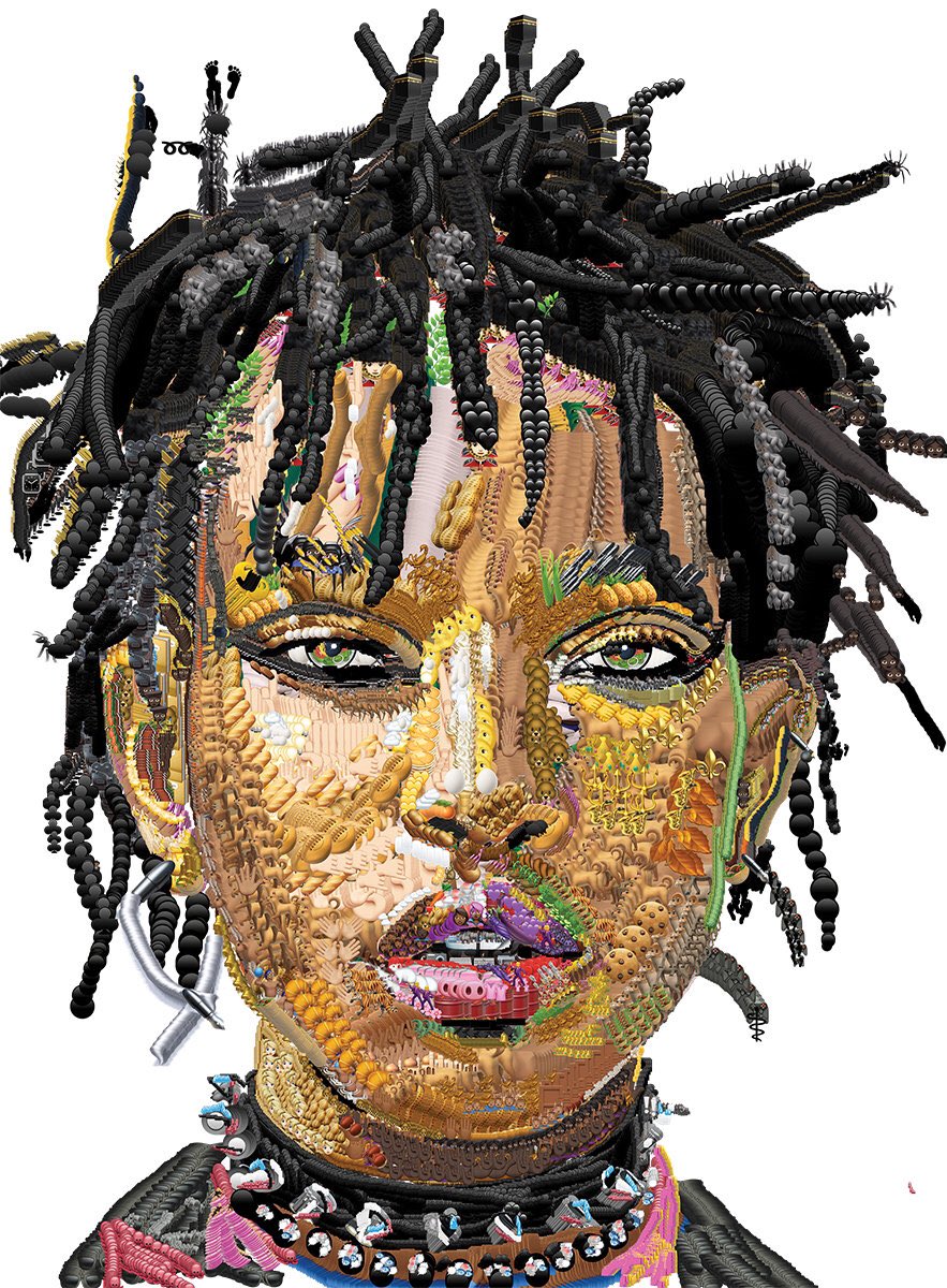
Yung Jake creates portraits by layering hundreds of emoji on top of each other. Personally, this makes me picture flat portraits that use emojis mainly as a color palette. But in reality, Yung Jake’s portraits have a lot of interesting textures and have a partial-3D type effect. Take a look for yourself.

https://pbs.twimg.com/media/B8DQKmKCUAAgx8-.jpg
Jay-Z


Willow Smith


Yung Jake isn’t your typical artist. His real name is Jake Patterson, but as Yung Jake, he splits his time between rapping and producing art. This New York Times article calls him a “sometime YouTube rapper, sometime art-world darling, sometime digital explorer.”

Most of his portraits feature celebrities, and he creates them using a program called Emoji Ink. It’s like the primitive Microsoft Paint program, but instead of colors or brushes, you use emojis to paint.

Yung Jake notes that these emoji portraits aren’t as deep as his other work, but this project has been his most well-known (celebrities + emojis = POPULAR!). You can see more of his emoji portraits on his Instagram, or check out his video work and music on YouTube.


What is Emoji Ink?

Anyone can access and use Emoji Ink, a program/app Yung Jake developed. After finding out that the app was accessible to anyone, my first reaction was actually disappointment.

It felt like the secret was out. Now anyone could imitate Yung Jake’s emoji portraits. But after trying out the program for myself, I changed my mind. Creating an amazing portrait on Yung Jake’s level would take a LOT of work.

Emoji Ink is a strange but fascinating form of media. You have to think carefully about colors and become somewhat familiar with what emojis are available. I’m an avid emoji user and there were still far more emoji than I expected.

Then there’s the matter of layering. The layers don’t just lie flat; they give off a 3D appearance, like you’re stacking physical objects on top of each other. It looks strange, like some weird rudimentary computer animation mock up. But that’s the nature of Emoji Ink.

Different emojis have multiple colors, of course, and the direction of your stroke changes which colors are dominant. Layering a watermelon emoji by painting in an upward stroke results in a lot of green, because of the green rind at the bottom of the emoji. But then click and drag down, and you’ll end up with a trail of mostly pink.

emoji ink watermelon example

It’s fun to fool around with. Here is my first try, a self-portrait attempt gone wrong.

emoji ink self portrait

I gave up and drew over my portrait, playing around with textures and those weird 3D effects.

Here are some more of my attempts at Emoji Ink. I’m calling this one Tree of Bats and Turtles. Because the trunk is made of bats and the leaves are turtles.

 emoji ink tree of bats and turtles

Drawing with each emoji is an entirely different experience. The turtle was clunky and had two shades of green. Using the sprout emoji for the grass felt a bit like cheating. It was light and easy to use for a grassy effect.

At first I was just saving screenshots, but you can save your image through the program. The icon’s nearly transparent in the bottom left corner – the second one that’s a box with an arrow inside it. The program automatically saves your background as transparent, so next I decided to try building my own background.

Here’s Monster and the Moon. That moon background was creepier than I intended.

Emoji ink Monster and the Moon

Emoji Ink does seem to move more slowly the more emojis you add, and I lost one attempt because the program froze. It’s not a perfect program. Or maybe I need a faster Internet provider. Or an iPhone.

Go Do (Emoji) Art

The next time you find yourself procrastinating, I challenge you to go create something in Emoji Ink. It’ll be entertaining at the least. And if you’re willing or feeling brave, share it!


Back to Kakao Friends: A History of Emojis in Art

Last week I gave you an introduction to the Kakao Friends emojis. You’re welcome.

This week, after you’ve processed the cuteness that is Tube, Muzi, Con, Neo, Frodo, Jay-G, Apeach, and Ryan, let’s get into art.

To find inspiration in Kakao emojis might seem pedestrian to some. Silly. Or worse, kitschy.

An upperclassman I worked with in college was always condescendingly declaring things “kitsch.” I didn’t know even know what that meant. Kitsch or not, artists find inspiration in all sorts of strange places.

Hung Liu – a famous middle-aged Chinese-American artist – was really interested in selfies back in 2014. When she visited my university, she took a selfie with every group or class she spoke with. (I was there three of those times.) The concept fascinated her. I wonder what she’s into now.

A History of Emojis in Art

You probably didn’t know it, but several artists have turned their attention to emojis. Emojis have a history with art. Well, a short one, seeing as they were only created in 1999 and didn’t make it to the US until 2007. Emojis came with the first iPhone but were somewhat hidden.

Since then, emojis have made their mark on the art world:


Emoji Dick – Fred Benenson

I wonder about the choice of title, but Emoji Dick is a translation of Moby Dick made entirely out of emojis. The project began as early as 2009 when creator Fred Benenson began a Kickstarter to fund the program.

Benenson crowd sourced the project through Amazon Mechanical Turk, an online marketplace where people can sell all sorts of skills. Benenson hired two rounds of workers. First, three different people translated each line. Then another set of people voted on the “best” emoji translations.

Emoji art-Emoji Dick-text-me-ishmael

You can find the book here, or read more about Benenson’s motivation on his Kickstarter page. I like this line best on motivation best:

“I also really like the whale emoji, so that seemed like a good fit, too.”


Boring Angel Music Video

A music video released in 2013 tells a story entirely with emoji. It’s clearer than Emoji Dick, flashing between narrated emoji choices repeatedly to ensure you get the message.

The video is a collaboration between experimental electronic artist Oneohtrix Point Never and internet artist John Michael Boling. It’s a simple story line enhanced by the music, a mix of orchestral, techno, and technology sounds.

The rapid flashing between emojis creates a gif-like effect, but fair warning, it’s a bit dizzying to watch.


Book from the Ground – by Xu Bing

Book from the Ground, the second emoji book in existence, is like a sequel for Chinese artist Xu Bing. He says, “Twenty years ago I made Book from the Sky, a book of illegible Chinese characters that no one could read. Now I have created Book from the Ground, a book that anyone can read. “

His first book project was composed entirely of made-up, unreadable Chinese characters. Book from the Ground crosses all language barriers by using emoji-style pictures. Bing tells the story with regular emojis and common symbols like traffic signs and logos.

Book from the Ground is a story about a White collar worker named Mr. Black. It took seven years to make and was finally published in 2014.

You can find the book here.


Garden of Emoji Delights by Carla Gannis

Garden of Emoji Delights is an animated collage of emojis layered over the Hieronymous Bosch Renaissance painting, “Garden of Earthly Delights.” The painting is already bizarre, depicting hell and a human fall from grace, but Carla Gannis just makes it ridiculous.

Her piece is outlandish and irreverent, but also completely fascinating. I could spend hours looking at all the minuscule details created with emoji gifs. But I’ll let you take a look for yourself. See the full video animation here, or check out this Buzzfeed article, which includes some pretty great close-ups.

Carla Gannis does other ridiculous emoji art too, which you can see more of on her website.


Emoji Portraits – Yung Jake

Yung Jake creates intricate emoji portraits, usually of celebrities, using a paint-like program. These portraits have a strange 3D look from the layering.

But I won’t say too much about Yung Jake because I’ve dedicated an entire post to his work and his app that you can read here:

http://monicaheilman.com/2017/08/15/emoji-ink/


Bonus: The Book Written Entirely Out of Emojis

Although it’s not well-known, and maybe not even considered “art,” the third known emoji book in existence is The Book Written Entirely Out of Emojis by a user who goes by “YarnStore” on Wattpad. Wattpad is a platform to share stories – usually regular stories that involve words. But in 2015, YarnStore decided to write a story entirely out of emojis.

It hasn’t been published or printed on paper, but users can comment on the story and have left some of their own thoughts in emoji. The potential for audience interaction is new, even if the idea of an emoji story is not.

Check out the book here; its readability lies somewhere in between Emoji Dick and Book from the Ground.


Emojis Entering the MoMA

Finally, perhaps the crowning artistic achievement of emojis was their inclusion in the MoMA October 2016. The MoMA now displays all 176 original emoji.

What do you think of all this? Is it ridiculous? Amusing? Perfectly normal? With emojis playing such a big role in our communications today, it only seems natural that they’ve made their way into the art world, in this artist’s opinion.

While deciding what to write about for this week, I kept thinking about the emoji characters from Kakao Talk, a popular messaging app in Korea similar to WhatsApp or Line.

Although it’s been nearly a year since my Fulbright grant ended and I left Korea, I think of Kakao emojis often. Only because my laptop is covered in Kakao character stickers.

Laptop with several Kakao Friends stickers and a few others

My personal favorite is Tube, the duck in the center, but we’ll get to that later.

Line might be more widely used, but Kakao is king in Korea. It’s pronounced a bit like cacao, with more emphasis on the first “ka.” Better yet, just listen to Obama pronounce it in the “Obama Talk” alert. This audio clip was pulled from a real speech and you can still use this alert today.

But the thing that distinguishes Kakao from Line is not its “Obama Talk” or its bright yellow color scheme. It’s the emojis.

Kakao Talk has the BEST emojis.

(And in case you get the two confused, we’re talking emojis here, not emoticons, which look like this: : ) or : – ( or ^_^. Emojis vs. emoticons is one of those things I look up, and then immediately forget. So this is just as much for my benefit as yours: An emoticon is text; and an emoji is a picture. It’s all explained here.)

Having awesome emojis is probably why everyone in Korea seemed to have such a strong emoji game. You can’t help but want to use the adorable Kakao Friends emojis. On top of that, these little characters each come with distinct personalities. We’ll go through them, and then you tell me what’s not to love?


Kakao Friends and Their Elaborate Backstories

Kakao friends characters standing in a line: Ryan, Apeach, Tube, Con & Muzi, Frodo, Neo, Jay-G

Since I first learned about Kakao friends – they were included in a workshop during my Fulbright Korea orientation – the company has revamped the character descriptions and added a new Kakao friend. I’ll include both versions for each.


Tube

Kakao Friends Tube

Kakao Friends Tube The cowardly duck with an angry altar ego

Yes he’s first because I’m biased. I don’t want to sway you too much, but Tube is the best. He has two main traits: his foot insecurity and his alter ego. Tube wears flippers to hide his small feet – in the first image you can see that one has fallen off. How adorable is that?

Kakao Friends Tube duck emoji falling backwards and losing one flipper

He also has a hulk-like alter ego: a green duck that breathes fire and destroys things. As a result, he gets the table flipping emoji.

Kakao Friends Angry Green Tube flipping a table with rice, soup and silverware

Muzi and Con

Kakao Friends Muzi and Con Kakao Friends Muzi and Con

Muzi is a definitely second favorite for me. He (or possibly she) is usually paired with Con, a tiny, alligator-like creature.

Kakao Friends Con sitting in office chair throwing paper airplanes

Muzi is by far the most creative character. At first glance, Muzi seems like a rabbit, but it’s actually a picked daikon  radish or damuji in Korean. Con is some sort of evil scientist who brought Muzi to life. Makes sense.

Kakao Friends Muzi and Con celebrating

When I used a Kakao Friends review game in class one day, my students were shocked to hear me use a male pronoun for Muzi. I always default to my students’ expertise on matters of Korean pop culture, so I conceded that I wasn’t sure about Muzi’s gender. In Muzi’s original bio above, the creator uses “he,” but in the updated version, the writers are careful to avoid any gendered pronouns and only use “it.”

Kakao friends Muzi with sparkly eyes holding Con


Frodo and Neo

Kakao Friends Frodo and Neo

Another pair usually grouped together, largely defined by their relationship, if you ask me. But in the revamp, they receive separate descriptions. Yay for progress!Kakao Friends Neo Bio

The Kakao Friends designers created each characters with different segments of the population in mind. And they were definitely spot on with “the couple.” Couples in Korea are a big deal, from couple outfits to the common 100-day anniversary gifts.

Kakao Friends Frodo and Neo crying and hugging Kakao Friends Frodo and Neo taking a selfie

Neo is a stylish, high-end cat. Honestly I don’t have much to say about Neo. She’s a stereotypical girly-girl But her emojis are fun.

Kakao Friends Neo doing a hair flip Kakao Friends Neo Posing in Compact Mirror

Also this Dragon Ball Z reference is excellent.

Kakao Friends Neo Super Saiyan mode


Kakao Friends Frodo

Frodo doesn’t have a lot going for him either; he just looks good. His emoticons cover stereotypical boyfriend stuff. Kakao Friends Frodo with bouquet of roses

Although it’s not in this description, people have also said that Frodo is a mixed breed, and therefore very sensitive to matters of birth and status. Perhaps this little detail is relatable in a society where most can trace their family history back to specific clans and regions.

Kakao Friends Frodo with heart eyes and forming heart shape with arms

Kakao Friends Frodo wearing sunglasses and trench coat in a fall breeze

Jay-G

Kakao Friends Jay-G

Woah, is this allowed? And/or racist? Jay-G seems to be a walking stereotype and his name is just too obvious of a rip-off. Fortunately in the update, designers have drawn out features besides “loves hip-hop” in the one character clearly coded as black.

Kakao Friends Jay-G

Jay-G used to be the boring wannabe rapper. He was a mole, which was interesting, but that was it. Now designers seem to be focusing more on his identity as a secret agent (who still loves hip-hop).  Kakao Friends JayG break dance

He’s the one who has interesting emojis that I never really use. I wonder if they’ll do more with this character.

Kakao Friends JayG bathtub


Apeach

Kakao Friends Apeach Kakao Friends ApeachHere’s a fun one. Apeach is a sassy peach who’s “not afraid to show off its backside.” And its name is literally “a peach.” Coincidentally, Apeach is another character who seemed to have gone from male to gender neutral.

Kakao Friends Apeach smiling with hearts Kakao Friends Apeach showing off backside


Ryan

And finally the last character is Ryan, the Kakao newbie. Ryan is the lion. The almost-rhyme/assonance is fun.

Kakao Friends Ryan

I can’t find the old version of Ryan’s backstory anywhere, so here’s this instead:

Kakao Friends Ryan King

Ryan came out sometime during my second year in Korea, so between late 2015 to early 2016. I still haven’t fully accepted him as Kakao canon. He also looks a lot like a Line emoticon character, which is questionable.

Brown Line vs Ryan Kakao

But I guess he has an okay backstory. Ryan the Lion – even though he looks more like a bear – is from Africa. Go figure. He’s insecure about not having a mane, which is kind of cute, but has already been done with Tube and his small feet.

Regardless, Ryan seems to be popular now.

Ryan cheering with glow sticks gif

Next week: A part 2 on Kakao emojis that actually ties them to my artwork.

http://monicaheilman.com/2017/08/08/emoji-in-art/

Artist Feature: Beyond the Controversy of Sally Mann

I’ve finally read Sally Mann’s 2015 book Hold Still, a personal and family memoir of the acclaimed artist’s life and ancestral influences.

Hold Still Sally Mann book cover

Mann is best known for the controversial photographs of her own children, particularly those that feature them in nude, sometimes sensual poses. Among other things, Hold Still gives us an inside look at the controversy through Mann’s eyes and its negative effects on her family. Interestingly, it was the controversy itself and others’ censorship of Mann’s photos that caused confusion and discomfort for her children.


By now the controversy is over and done with, but sadly it remains the primary cause of Mann’s fame. But naturally, there’s much more the general public doesn’t know about this artist.


Dead Bodies

Sally Mann’s photos alternate between nostalgic, Southern landscapes and the gritty, uncomfortable facets of life. One of the most shocking chapters in her novel is the body farm – I was previously unfamiliar with this body of work – in which Mann visits a site that allows dead bodies to decompose naturally outdoors. For study, of course, and apparently art.

Sally Mann Body Farm series
Body Farm series, 2000-2001

I was eating lunch while reading this chapter and promptly set my sandwich aside. While I’m not especially squeamish, the reality of this chapter got to me. Mann describes two men who bring their friend’s dead body to the farm, honoring his last wish. As the scene unfolds with Mann’s commentary, we see the stark contrast between a “normal” reaction to the dead, the two friends sobbing as they carry the fresh body to its designated spot, and Mann’s detached response, as a scientist/artist who has spent the last few days examining dead bodies not much different from this one.

This chapter is eerie. It held my complete attention, my lunch pushed away and forgotten.


Your History in Boxes

Large sections of the book – the majority perhaps, since it is a memoir – deal with Mann’s family history. She describes members of her family, the stories of parents and grandparents, as a journey through boxes of old photographs and papers. We the readers are witnesses as she pieces together what she knows about her family with what she discovers in these boxes.

I imagine that writing this history must have been cathartic. To trace your family all the way back to the Mayflower must hold a special kind of significance. But I’ll admit she lost me here.

How nice – and strange – that her family history is so plainly and clearly laid out. How nice that you can trace your genealogy back to a rich, influential great-grandfather. These lengthy descriptions and documentation of Mann’s family have me wondering if this is normal and if my family, without records beyond two generations, is the strange one. But there’s no single normal in America, and this is as good a reminder as any of how diverse cultures in this country are.

Statue of liberty at sunrise

My mom’s side, Korean, from the North and South, with speculations about whether we have Indian blood in our veins.

My father’s side, German immigrants two or three generations back, who kept any family records and secrets hidden away from the newest family members. Maybe these records don’t even exist.

Perhaps Mann has made me aware of a loss, something I never knew I didn’t have. With both sets of my grandparents inaccessible – through distance, language, and relationships – my family history is shrouded. This history might die with my grandparents, never to be passed on. Pieces of it have already been lost, I’m sure, and the thought is a little sad.

Thanks a lot, Sally Mann, for taking me down this train of thought.


Confronting a Racist Reality

Now I leave that topic for an equally lighthearted one: racism.

Yes, Sally Mann tackles racism. Another series of photos I knew nothing about. She is honest and realistic in her approach and explanation. It’s natural, a photographer exploring racism through photography. Mann admits that the endeavor may have been futile. She questions how she can expect to resolve decades of racial strife in a single session with her models. She can’t, but she tries.

Nothing is ever accomplished without trying, but art that is trying too hard doesn’t usually accomplish very much. This is not meant to be a scathing critique of Mann’s work, but a reflection that extends to my own artwork.

How do you create artwork that tackles the tough issues but remains art?


Maybe – because this article needs a conclusion – like Mann.

By drawing on what occurs naturally – a naked child going for a swim or decomposing bodies – and striving to capture it in a way that helps the viewer see what you do.

One Week of Artist Trading Cards

Okay. One week has gone by. And just as I promised, I did make artist trading cards. Deadlines and accountability work for me.

That doesn’t mean I produced anything great. This week I continually reminded myself that this was a case of quantity over quality, which felt really strange. Isn’t this the complete opposite of how I usually work? Isn’t “quantity over quality” morally questionable for a perfectionist? Maybe that’s why I don’t produce very much.

But I did it – I made 10 cards!

Conflicted over Collage

I started Tuesday night and decided to work with collage. I don’t really understand how I came to like collage. I think before I started using it (in 2014), I even had a subtle disdain for it. It just wasn’t what I’d choose as my creative outlet. But now I like collage. It’s strange – for whatever reason – to think of myself as someone who likes collage.

A Magazine Mishap

I had plenty of materials to use. For some reason, I’ve been getting copies of Allure magazine in the mail. I did not sign up for this magazine. I have no interest in subscribing to this magazine. I’ve never even visited their website, at least not to my knowledge. At first, I was worried that there’d been some mistake and I’d end up owing money. But the magazines keep coming. So I’m jaded now. Why not use them for art?

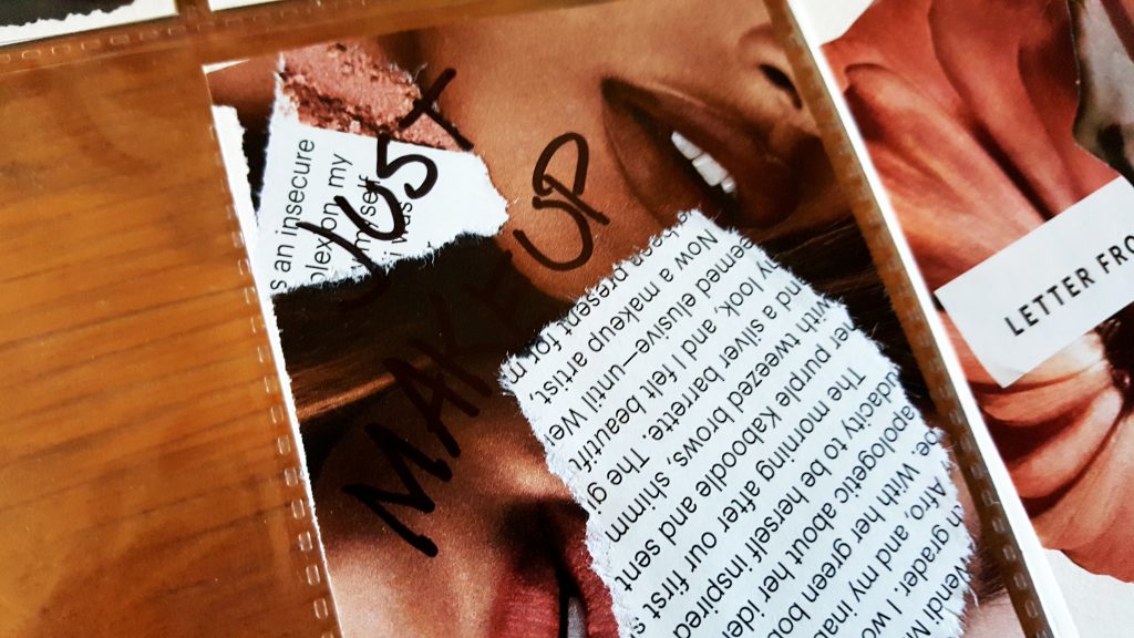
My first two artist cards are very obviously from a beauty magazine. They stick to a pink-pastel color theme. I’ve written “Just Makeup” in permanent marker on the first one. The text is nothing special. I think one is an article on Janet Mock.

magazine make artist trading cards

just makeup make artist trading cards

Cowed by Cows

Then the week sped by, and it was already Friday evening. So I did some later that night. I took to permanent marker and thought I’d try my hand at those cartoon cows again. I was disappointed, but here they are. Quantity over quality. Better to create something bad than nothing at all.

cow make artist trading cards

So I returned to collage. I wasn’t willing to put in the mental energy required to plan out a drawing or painting, maybe. This time my color theme was blue. I tend to use a lot of reds in my work. Even in the way I edit my Instagram photos. I only noticed after seeing another user’s account who used primarily cool, dark colors.

Getting into the Groove

Anyway, I did a collage with doves, which look more like city pigeons or seagulls. Obnoxious. The second just uses color and shape. They’re actually the reflections from a pair of expensive sunglasses. The colors looked pretty, the glasses did not.

doves make artist trading cards blues make artist trading cards

Something I was really excited about was sticking an eyeball – just a pupil – on a tiger butterfly. But then I didn’t know what to do with it. I glued the pupil-butterfly onto a white card but later peeled it off. It ended up on an amalgam of sky blue and green grass snippets.

pupil butterfly make artist trading cards

Potential

The last three I did are unfinished. I think they have potential, but they just need a little something.

There’s a yellow background I originally did for the butterfly. Then some weird beauty product close-ups that look like gemstones and globs of jelly. They’re interesting. That’s all.

unfinished make artist trading cards

This week I’ll see what else comes out. But no promises this time.

What Are Artist Trading Cards and How Do They Relate to Neopets?

I’ve always been drawn to trading cards. Those little pieces of art with characters or creatures you love. I can’t explain why for years of my childhood I’d beg my mom to get me a pack of Neopets cards. How for a short period of time I only wanted to go to McDonald’s because Happy Meals had limited edition promo cards.

Then I got tired of them and gave my cards to my sisters, who then gave them away to our neighbors. Who knows where they are now. The trash seems likely.

But even though I’m not into Neopets anymore, trading cards still have an appeal.


A Collaborative Cultural Performance

Fortunately, an artist named M. Vänçi Stirnemann must have had the same fascination with trading cards that I do. In 1997, he created the idea of artist trading cards. Except since he’s also a performance artist, he envisioned them as a sort of massive collaborative performance between artists around the world.

His project is still going strong today, and there are artist trading card (ATC) events held around the world. Most of the 2017 events will be held in Canada.

I first learned about ATCs from my high school art teacher. A small group of interested students created and traded a few cards, but I have no recollection of any of the cards I either made or received. I was into cows at that time though, you could just pretend that this was one of mine:

Fake Artist Trading Card Cows

Blocks for Sale

I once ran across a similar concept at a Denver First Friday art walk. There was an art vending machine – how cool does that sound? – that sold wooden blocks with art on them. A 3D version of trading cards. I still have mine, although that was at least 3 years ago. It sits on my desk, with some change and a Korean shot glass on top.

art block on desk

art vending machine block

Back at the Artist Trading Cards

The reason I have artist trading cards on my mind is because of a recent attempt to make some. My sisters hatched a plan to get back into doing art regularly with artist trading cards. I jumped on board and we agreed on a deadline.

I sat down, cut some paper into card-sized rectangles, and they did the same. Then on our self-imposed due date, we had completed a grand total of…

0 cards.

Zero.

None.

At least we were all on the same page.

But this time, I promise to make some cards. And you all can keep me accountable. See you this time  next week.


How You Can Start Making Artist Trading Cards Too

Fyi, the section below contains a couple affiliate links, which means if you make a purchase through a link, I’ll receive a small commission, at no extra cost to you.

If you’re interested in artist trading cards, you can learn more at Stirnemann’s official site. You can also try exchanging cards through the International Card Deck Swap, although I’m sure there are many other opportunities to trade artist cards.

Some artists cut their own cards (me), some buy cheap playing cards and paint over them, and of course, you can purchase ready-made cards from Strathmore or Ampersand.

Strathmore in particular has a wide range of papers and textures available that I plan to try out…after I use up the cards I’ve already made.

So what do you think? Will you try making artist trading cards? Or will I have to do this alone?


Update: 10 artist trading cards, here for your viewing pleasure.