One Week of Artist Trading Cards
Okay. One week has gone by. And just as I promised, I did make artist trading cards. Deadlines and accountability work for me.
That doesn’t mean I produced anything great. This week I continually reminded myself that this was a case of quantity over quality, which felt really strange. Isn’t this the complete opposite of how I usually work? Isn’t “quantity over quality” morally questionable for a perfectionist? Maybe that’s why I don’t produce very much.
But I did it – I made 10 cards!
Conflicted over Collage
I started Tuesday night and decided to work with collage. I don’t really understand how I came to like collage. I think before I started using it (in 2014), I even had a subtle disdain for it. It just wasn’t what I’d choose as my creative outlet. But now I like collage. It’s strange – for whatever reason – to think of myself as someone who likes collage.
A Magazine Mishap
I had plenty of materials to use. For some reason, I’ve been getting copies of Allure magazine in the mail. I did not sign up for this magazine. I have no interest in subscribing to this magazine. I’ve never even visited their website, at least not to my knowledge. At first, I was worried that there’d been some mistake and I’d end up owing money. But the magazines keep coming. So I’m jaded now. Why not use them for art?
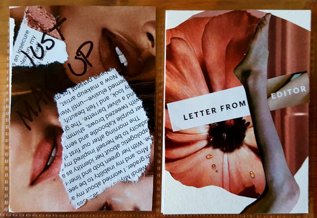
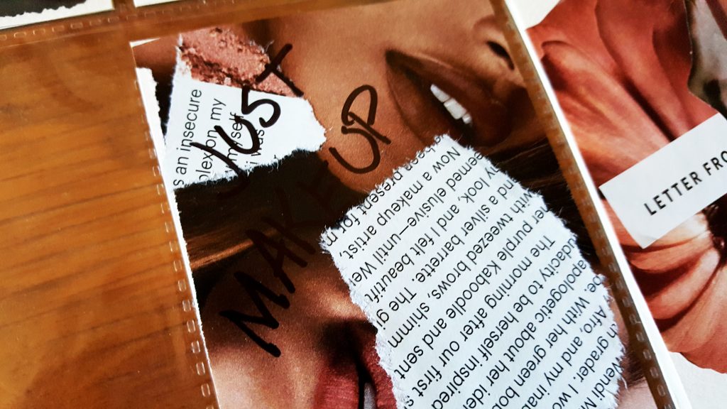
My first two artist cards are very obviously from a beauty magazine. They stick to a pink-pastel color theme. I’ve written “Just Makeup” in permanent marker on the first one. The text is nothing special. I think one is an article on Janet Mock.
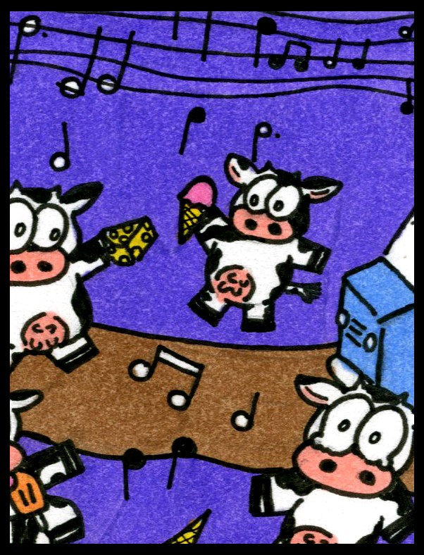
Cowed by Cows
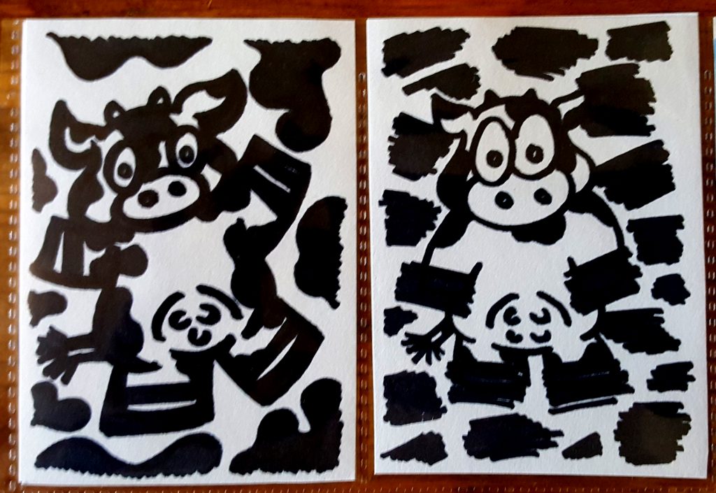
Then the week sped by, and it was already Friday evening. So I did some later that night. I took to permanent marker and thought I’d try my hand at those cartoon cows again. I was disappointed, but here they are. Quantity over quality. Better to create something bad than nothing at all.
So I returned to collage. I wasn’t willing to put in the mental energy required to plan out a drawing or painting, maybe. This time my color theme was blue. I tend to use a lot of reds in my work. Even in the way I edit my Instagram photos. I only noticed after seeing another user’s account who used primarily cool, dark colors.
Getting into the Groove
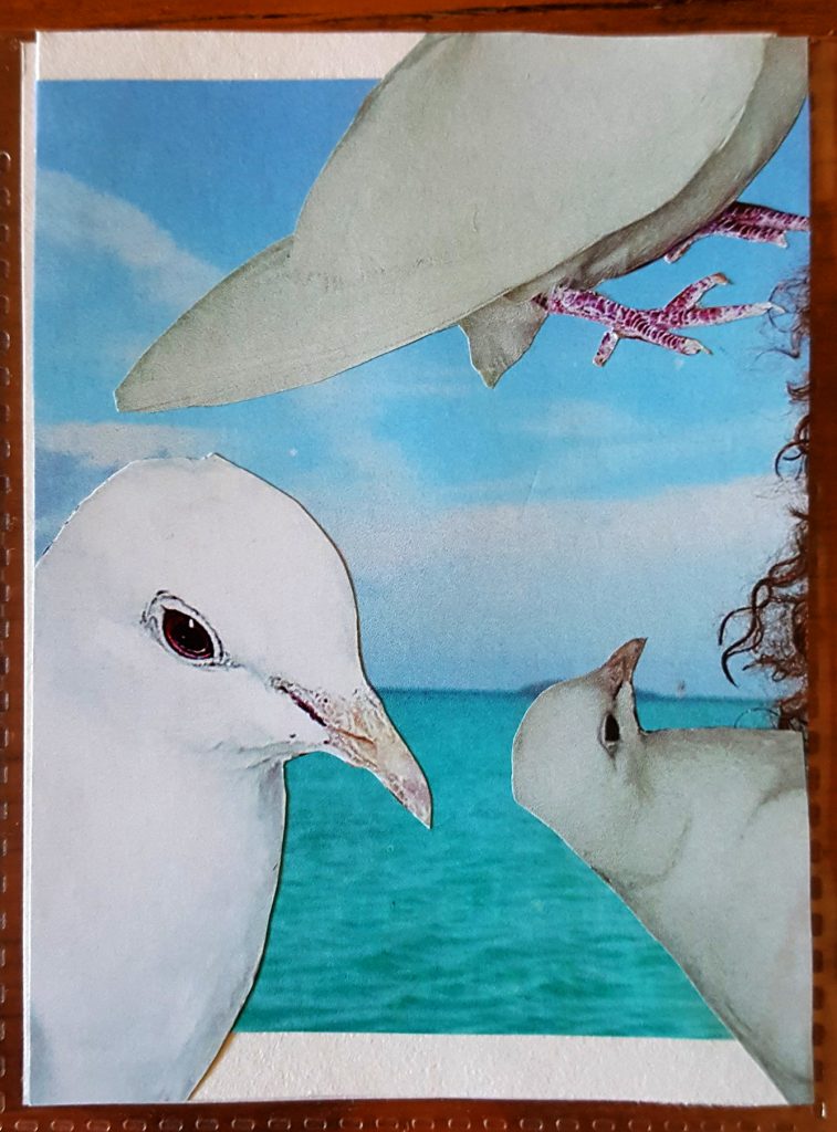
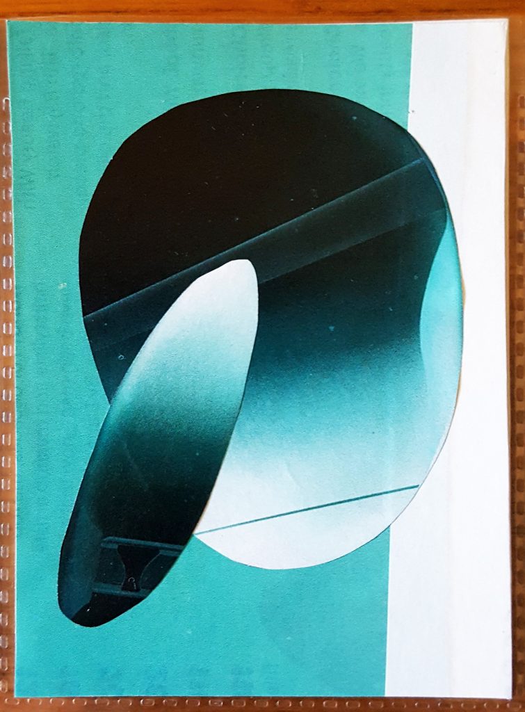
Anyway, I did a collage with doves, which look more like city pigeons or seagulls. Obnoxious. The second just uses color and shape. They’re actually the reflections from a pair of expensive sunglasses. The colors looked pretty, the glasses did not.
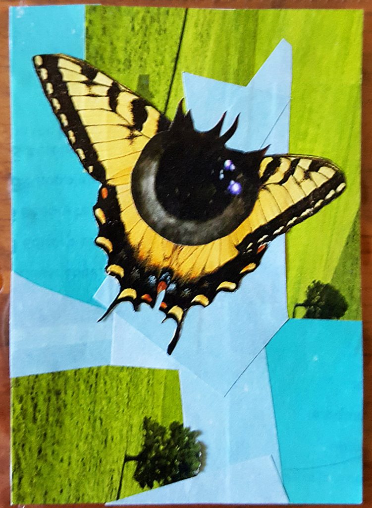
Something I was really excited about was sticking an eyeball – just a pupil – on a tiger butterfly. But then I didn’t know what to do with it. I glued the pupil-butterfly onto a white card but later peeled it off. It ended up on an amalgam of sky blue and green grass snippets.
Potential
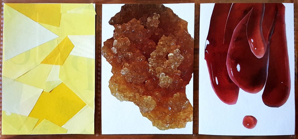
The last three I did are unfinished. I think they have potential, but they just need a little something.
There’s a yellow background I originally did for the butterfly. Then some weird beauty product close-ups that look like gemstones and globs of jelly. They’re interesting. That’s all.
This week I’ll see what else comes out. But no promises this time.
